Cart and recommendations in different content types – step-by-step configuration
You can add customer cart and product recommendations to the following content types:
- emails – as a content block called Recommendations. (Note: The customer cart is not available in email messages.)
- pop-ups, banners, and emails in scenarios – as a content block called Products.
Both elements – cart and recommendations – are available in the editor, under the Content tab.
Creating content with cart
Cart is a dynamic content block that shows users their abandoned cart contents.
Displaying content with cart items on your store’s website or in the email inbox is a popular strategy for reminding customers about their unfinished purchases.
Here’s how to create content with cart in the editor:
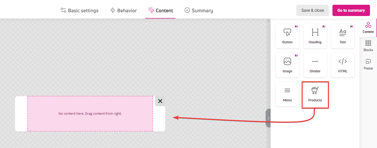
- Click the Content tab in the progress bar. The editor window will open.
- In the left panel, click the Content tab, find the Products block and drag it onto the workspace.

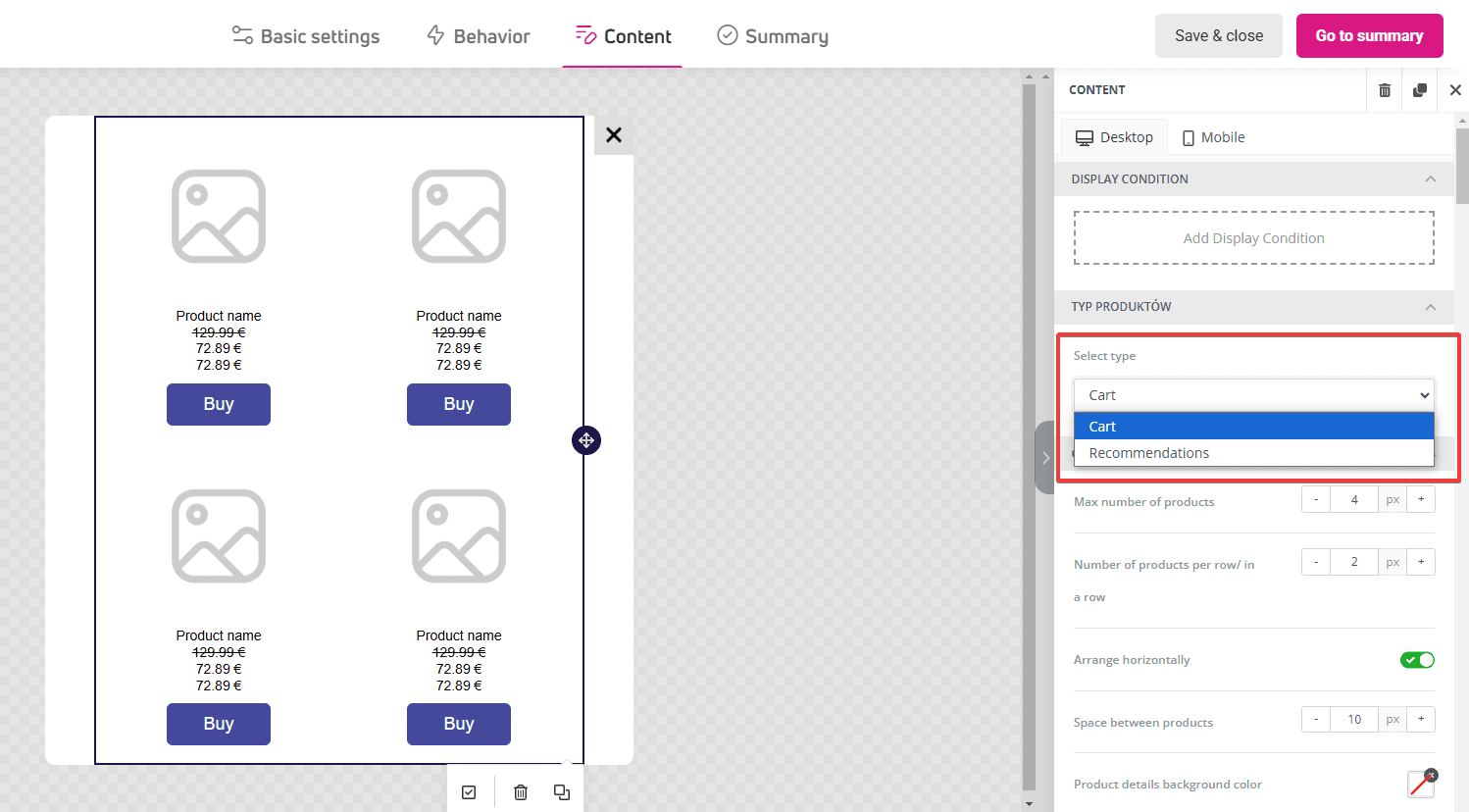
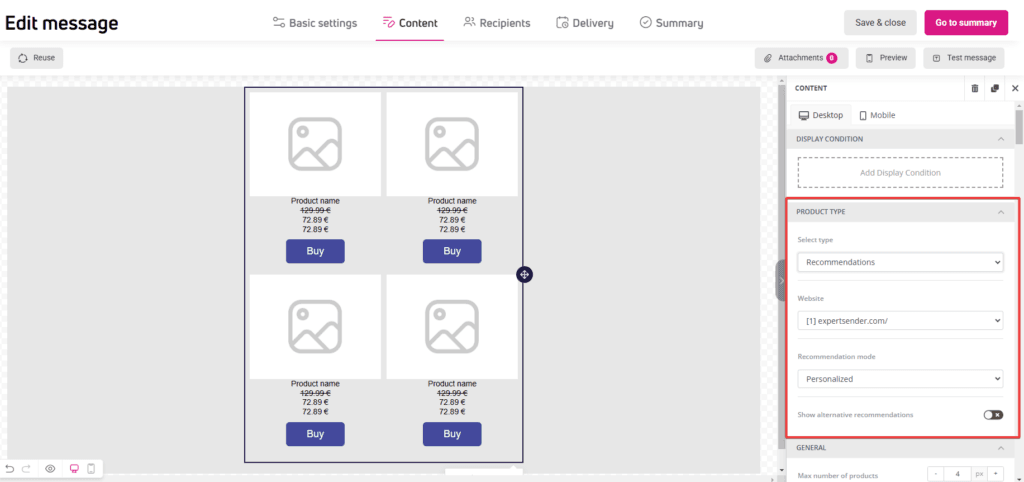
- You’ll find block settings in the panel. In the Select type section, find and click Cart.

Information placed in the cart, such as product name, image, price, and links leading to respective product pages or the cart page, are automatically adjusted for each customer.
Creating content with recommendations
The recommendations block displays personalized content based on customer behavior on your website, their purchase preferences, and the similarity of recommended products.
Recommendations are a service that requires additional configuration and pricing. If you don’t have access to recommendations in the «Products» block, it means your plan doesn’t include them. You can activate them by contacting our customer support team.
Here’s how to create content with recommendations:
In email messages:
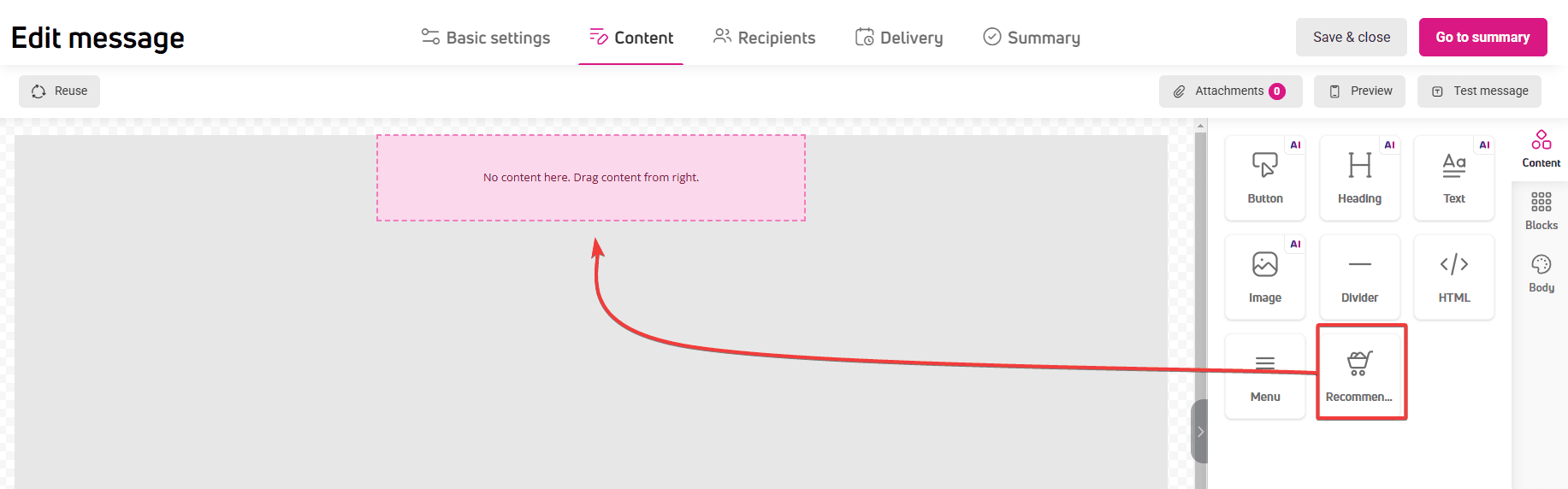
- Click the Content option in the progress bar. The editor window will open.
- In the left panel, click the Content tab, find the Recommendations block and drag it onto the workspace.

In pop-ups, banners, and scenario email content:
- Click the Content option in the progress bar. The editor window will open.
- In the left panel, click the Content tab, find the Products block and drag it onto the workspace.
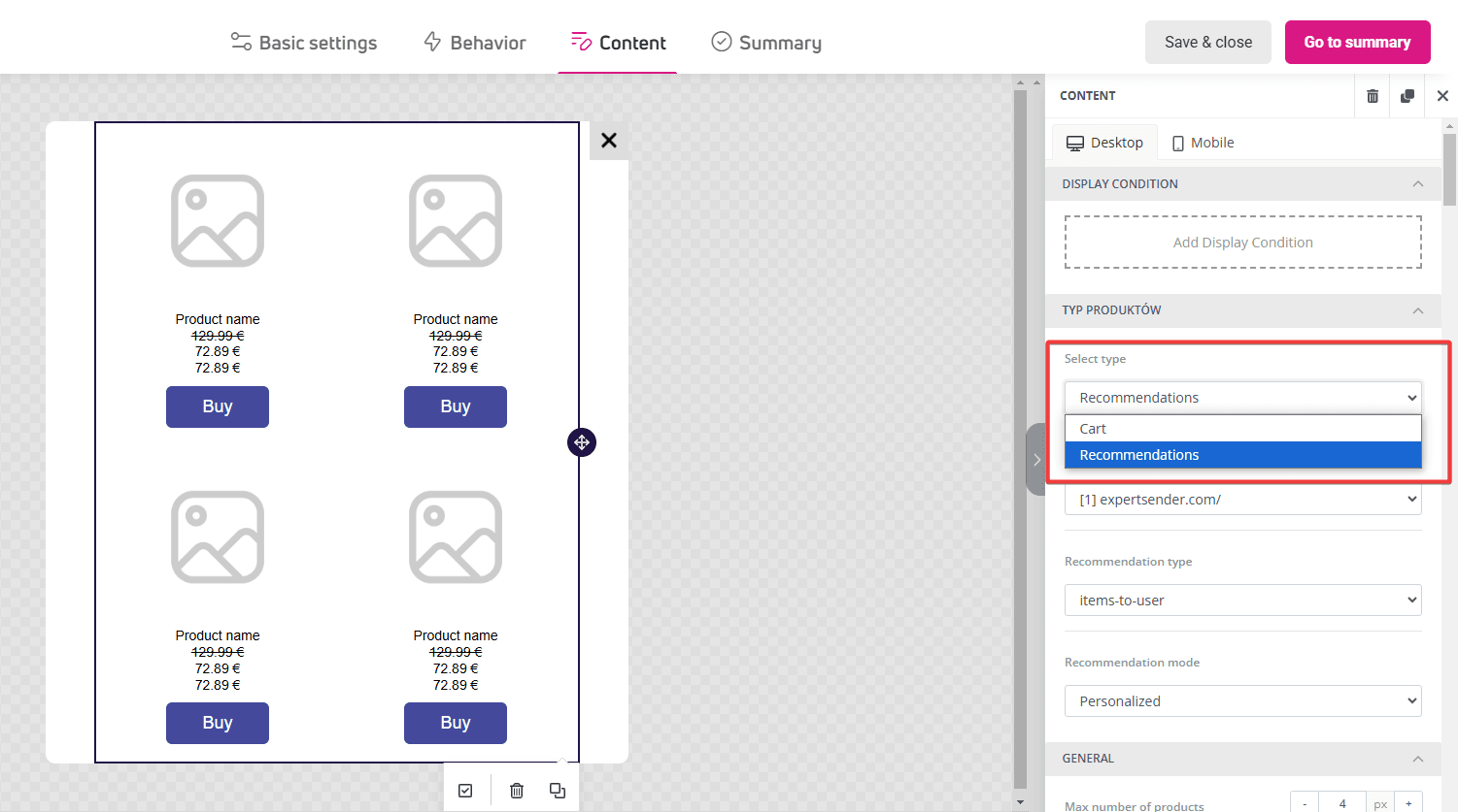
- You’ll find block settings in the panel. In the Select type section, find and click Recommendations.

You can customize content display by selecting the recommendation type and mode.
Recommendation types:
- Items-to-user – these are product suggestions based on user activity, such as viewed products, cart contents, or completed orders.
- Items-to-item – these are suggestions for products related to the currently viewed item, such as alternatives or complementary products.
Recommendation modes:
Both types have modes suited for different marketing scenarios:
- Items-to-user:
- Personalized: individual recommendations tailored to user preferences.
- Complementary: products that work well with cart contents or previous purchases.
- Bestsellers: top-selling products.
- Popular: currently most frequently chosen by other users.
- Items-to-Item:
- Similar: products with features like the viewed item.
- Bestsellers: popular in the category or among customers buying the given product.
- Cross-selling: complementary products that can increase cart value.
You can only use one recommendation block in your designed content.
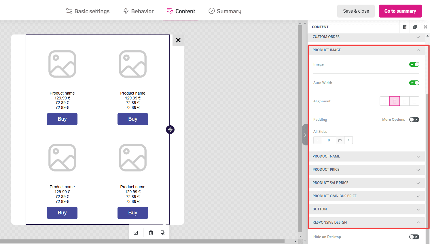
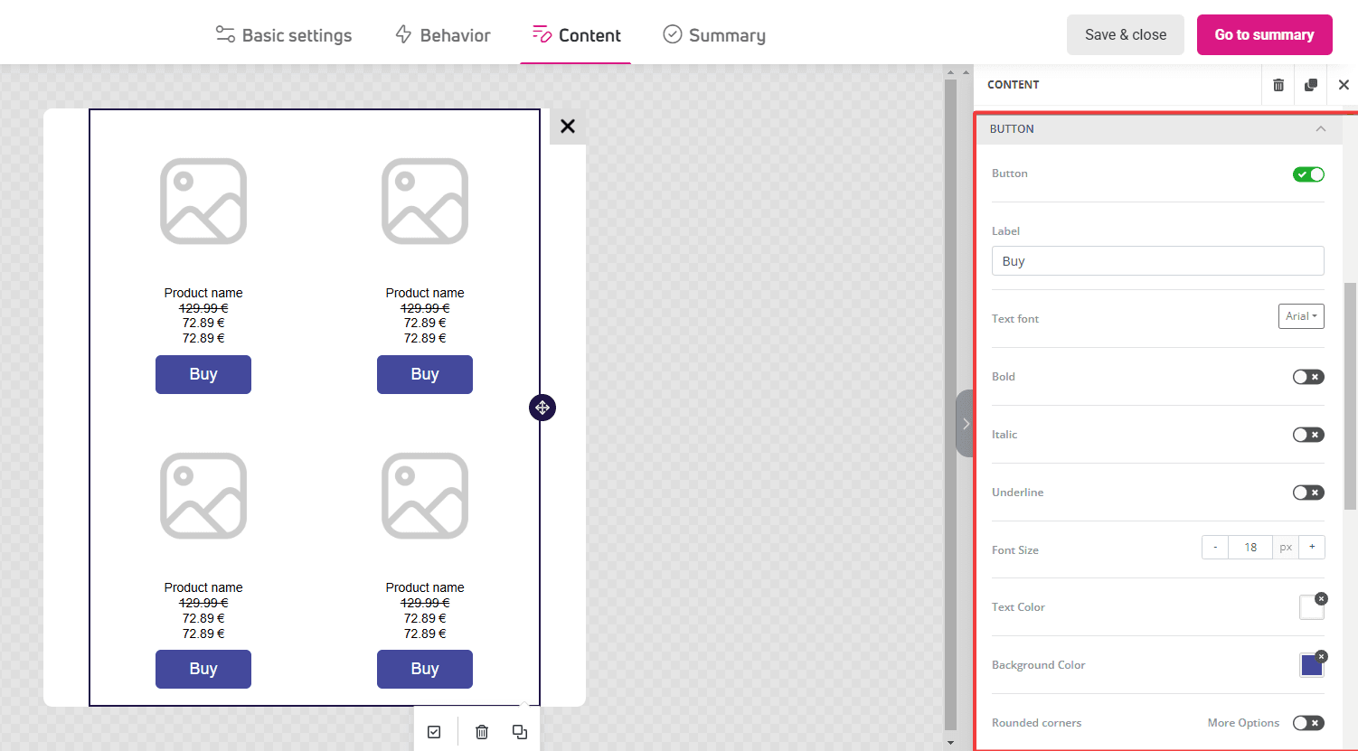
Product appearance in cart and recommendations
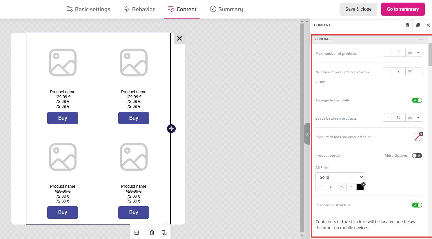
After selecting the product type, you want to display, move on to designing their appearance. These settings are identical for both cart and recommendations:
- General block settings: maximum number of products in the block and in one row, their layout (vertical or horizontal), and borders and margins.

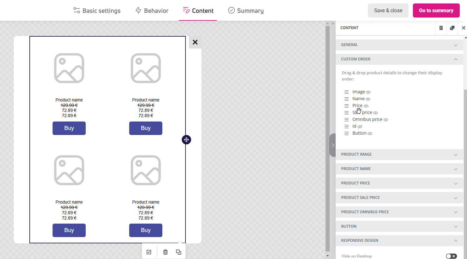
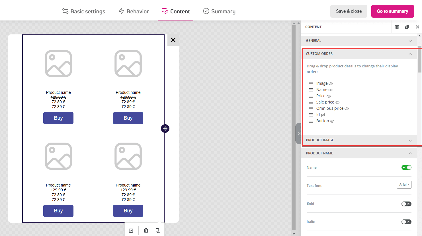
- Display order of products and their data. You can learn more about them in the Product details and display order section.

- How product data should look, such as ID, name, images, and the number of products displayed in the cart.

- Button appearance and label.

- Product prices: regular, discounted, and Omnibus price. You can learn more about them in the Types of displayed product prices section.

- Responsive design: whether the block should display on computers or mobile devices.
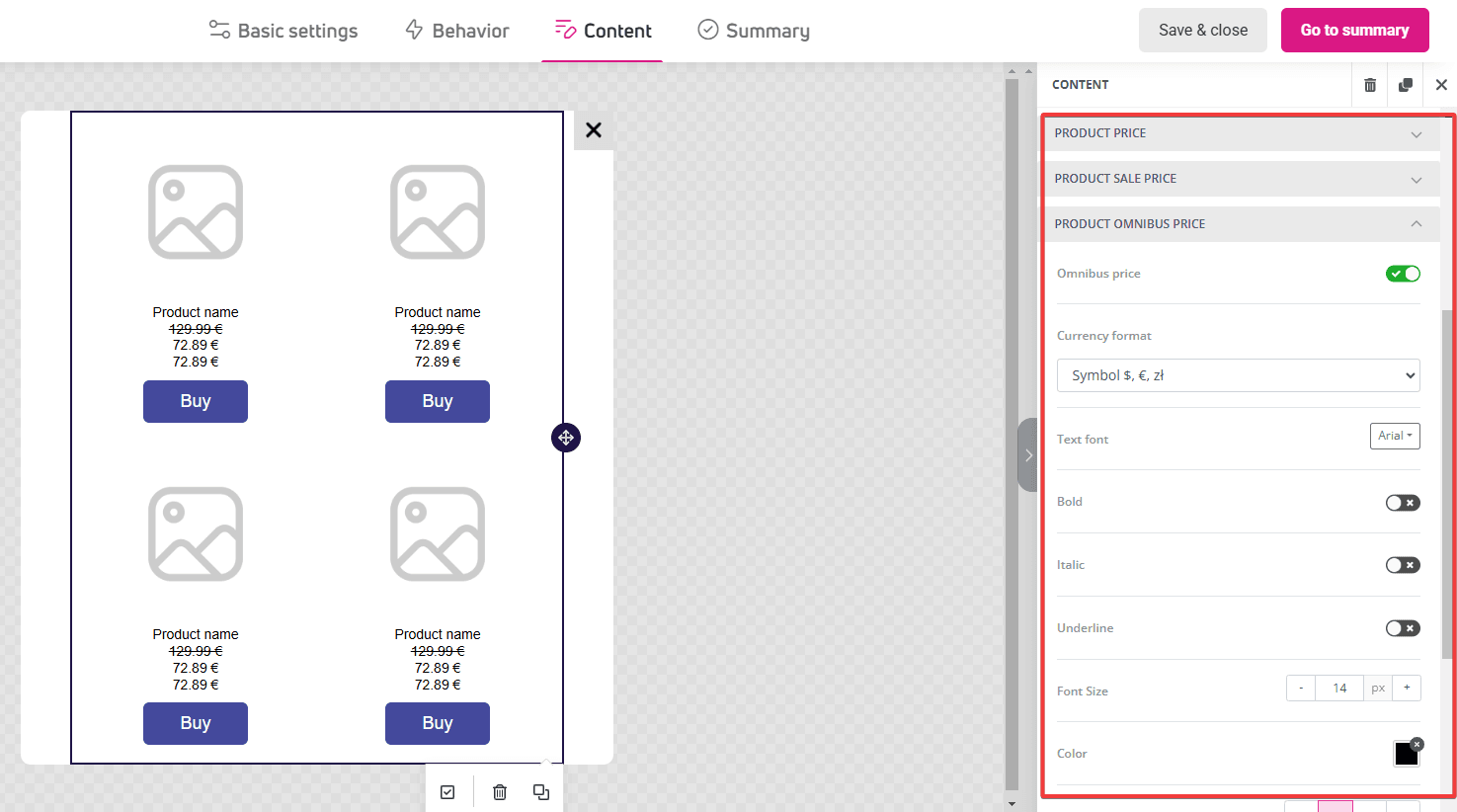
Types of displayed product prices
Displayed prices are pulled directly from your product feed, either uploaded on self building option.
, depending on the op, allowing real-time information updates. Since your store may have both regular and promotional prices, you can decide which price types should be visible in the cart or recommendations.
Additionally, to comply with European Union regulations, we’ve added the option to display the Omnibus price, which aims to protect consumers from unfair pricing practices.
You can configure three types of prices displayed in content:
- Regular price
- Displays the standard product price last seen by your customer.
- If the product is available at a discounted price, the regular price will be shown as crossed out.
- In case of regular price changes, e.g., permanent increase or decrease without promotional character, we’ll display this updated price.
- Sale price
- Displays the current, reduced product price.
- If there’s no discount (i.e., the price equals the regular price) or if the discounted price is 0, it won’t be displayed.
- Perfect for emphasizing current promotions and discounts.
- Omnibus price
- Displays the lowest product price that was in effect 30 days before the last discount was introduced.
- Required by regulations stemming from the Omnibus Directive to ensure transparency in promotions for consumers.
- We only display it when the discounted price is also available, so users can see the context of price changes.
Combining different prices not only supports your marketing goals and improves conversion but also builds trust among your customers through transparent discount information.
Product details and display order
In this section, you set the display order and visibility of each product’s data, such as name, price, image, or button.
To change the default order, drag a category to the desired location.