How does the editor v2 work?
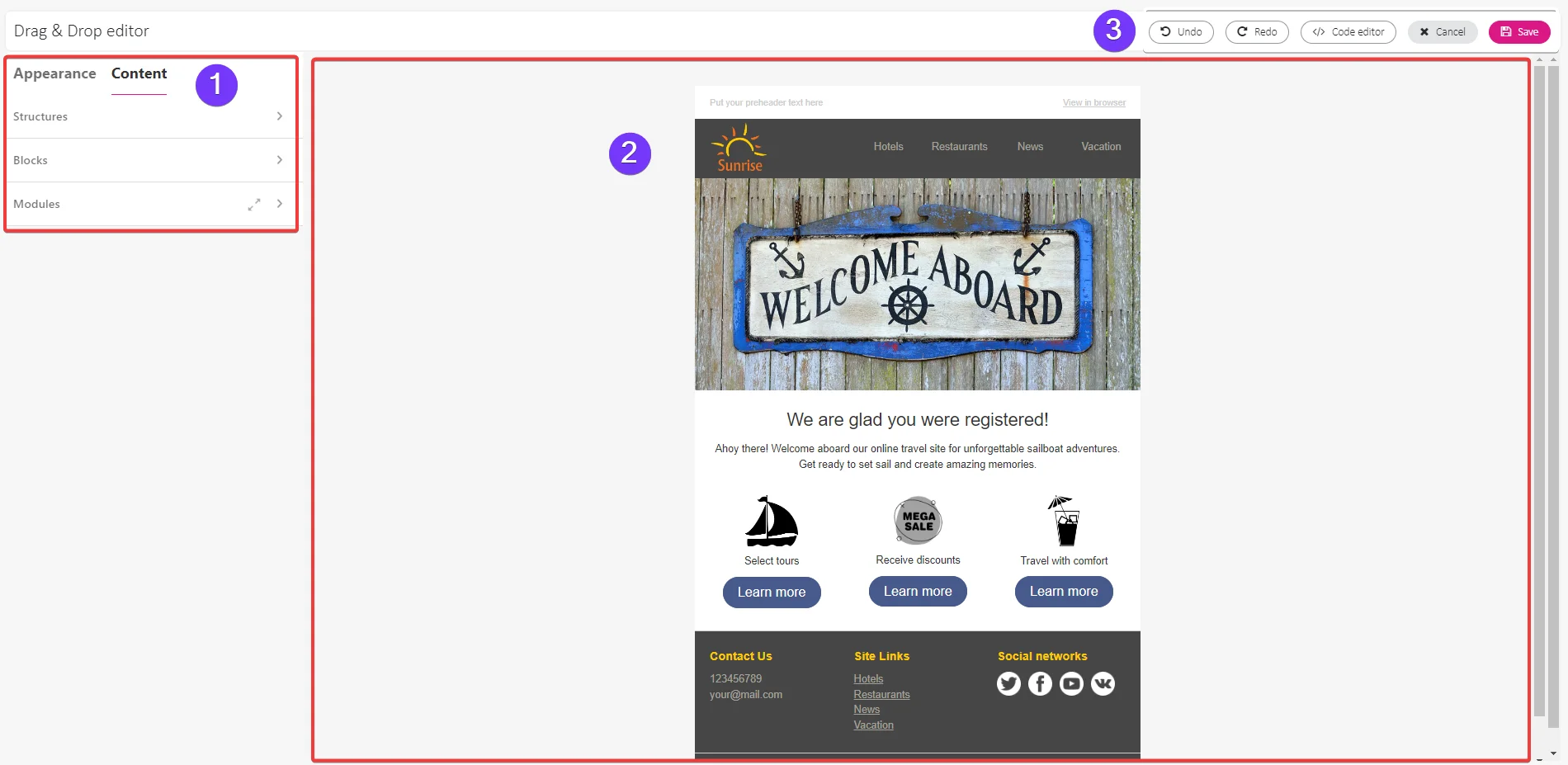
The Drag&Drop editor consist of three parts:
-
The Setting panel
-
The Working space
-
The Top toolbar
The Setting panel
The Setting panel is located on the left side of the Working space. It contains all the building elements used to create email templates and individual settings for these elements.
The Setting panel is divided into:
-
Appearance menu
-
Content menu
Appearance menu
Appearance menu contains basic settings that apply to the entire email. Once you set them for a specific element, such as a stripe, heading or button, they will apply to that element throughout the entire email, regardless of how many time you use it.
The Appearance menu provides access to:
-
General settings,
-
Stripes,
-
Headings,
-
Buttons,
-
Mobile formatting.

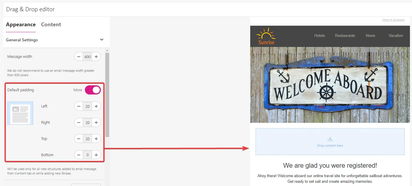
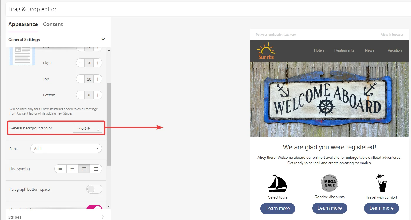
General settings
Here, you will decide on the style for the entire email. The most important controls are:
- Message width – we recommend keeping it at standard 600 pixels for desktop email clients.
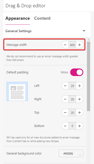
- Default paddings – fixed paddings for the structures used in the email template. You can set padding for each side separately or remove them.

- Background color and image – applies to the entire area behind the email message and will only be visible on desktop email clients, not on mobile devices.

-
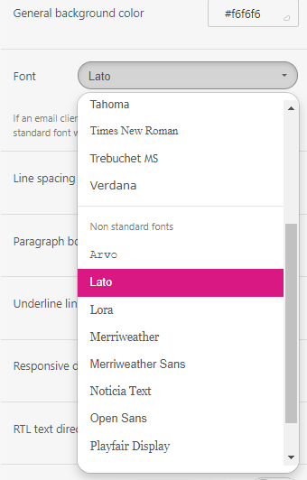
Font – this setting apply to all text block excluding headings.

-
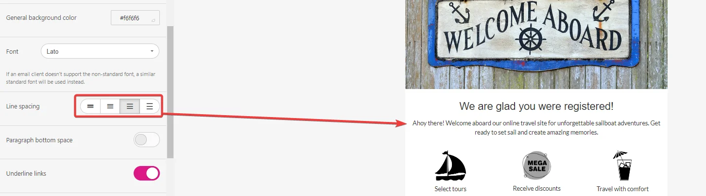
Line spacing – the distance between text lines.

-
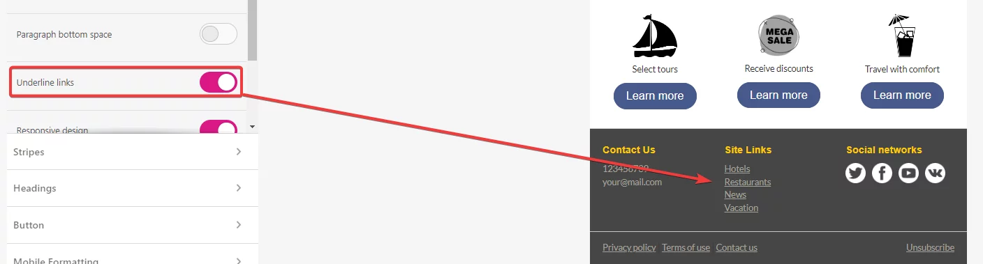
Underline links – helps underline specific texts, such as subscribe or unsubscribe links.

-
RTL text direction – enables setting the text direction form Right To Left.

-
Responsive design –always on by default. If you turn it off, your emails on mobile devices will look like on the desktop email client.

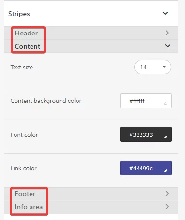
Stripes
A stripe is an email area, that contains structures with containers and content blocks. Stripes organize the email content into groups with defined roles and general settings, such as header, footer, content. Stripes are on the top of hierarchy of email template elements in this Drag&Drop editor.
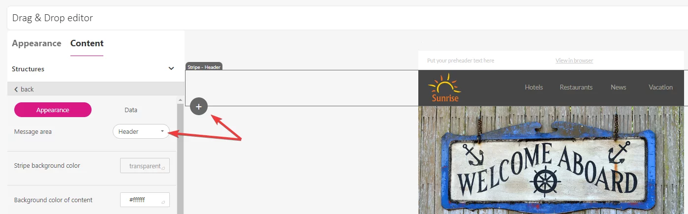
To add stripes, click the + icon at the bottom left corner of the stripe in the working area. The edit menu will open on the left, where you can choose the stripe type: header, footer, content, info area.
To define general settings for each stripe type, go to Appearance menu > Stripes. Set the font size for each stripe, choose the font, link and content background color. These settings will apply each time you add a new stripe to the message you are working on.
You can save the entire stripe as a Module, and reuse it in other email messages. This way, you will reduce the time you spend on creating emails. 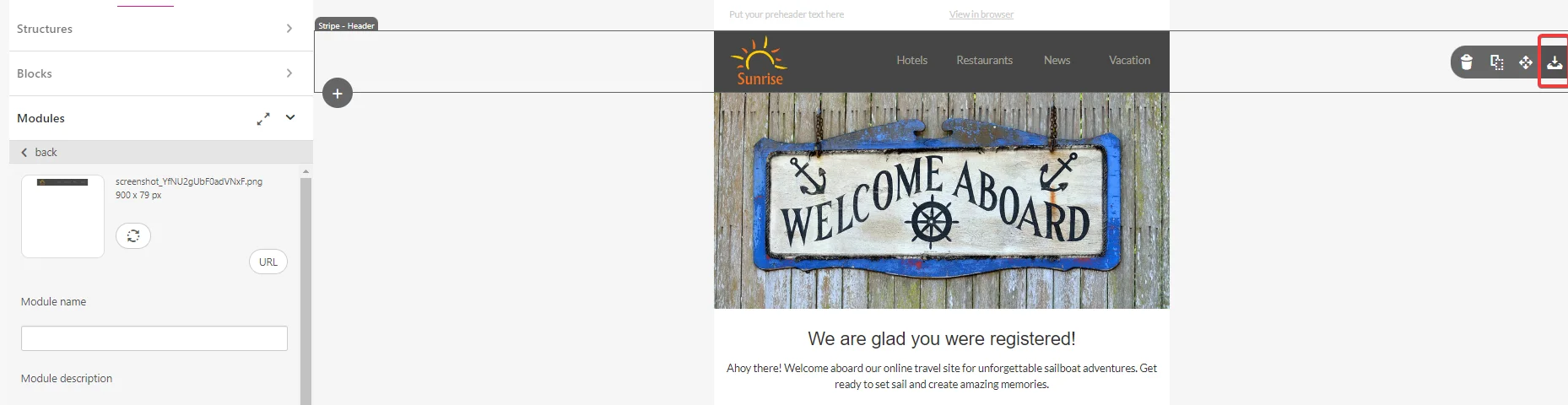
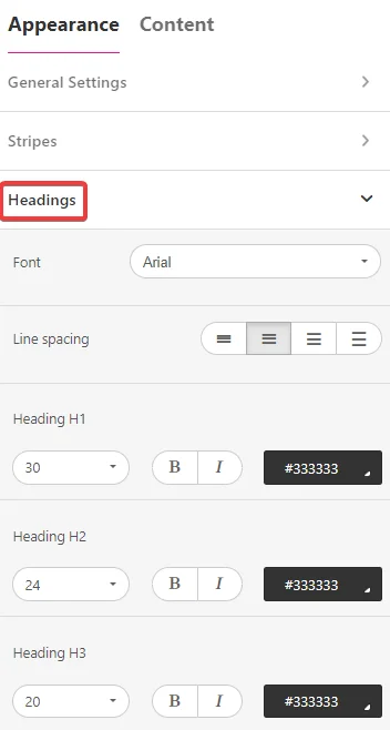
Headings
Headings contains settings for texts, that needs to be highlighted, e.g. quotations, headlines or buzzwords. You can choose font and line spacing for all headings and also set different font requirements individually for each heading. 
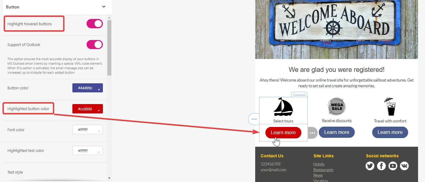
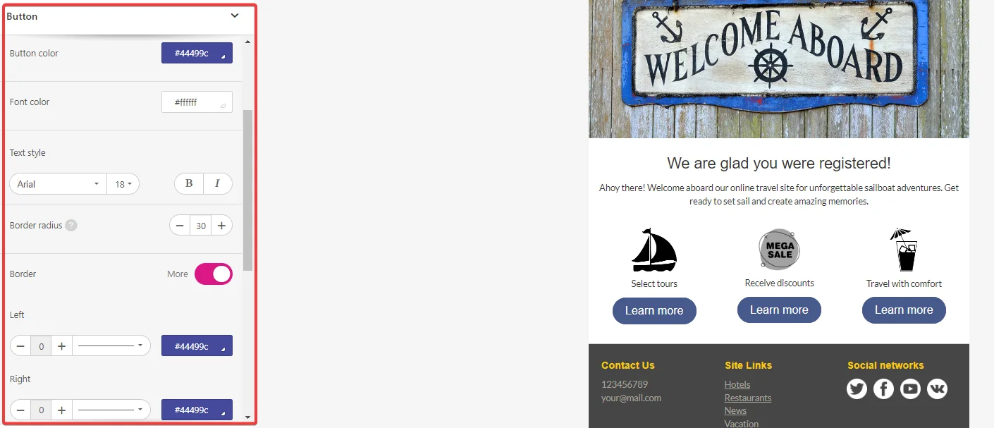
Buttons
Here, you can adjust the button style across the entire email, ensuring they appear consistent throughout the message and grab users’ attention efficiently. The parameters you can set in the Button section include:
-
Highlight hover buttons – the button colors will change when you hover the mouse over them.
-
Support of Outlook – allows improving buttons displaying in Outlook by inserting a special VML-code element.

-
Font size, font style and color.
-
Button color.
-
Border radius.
-
The content border with an option to customize the border color.
-
Internal padding,

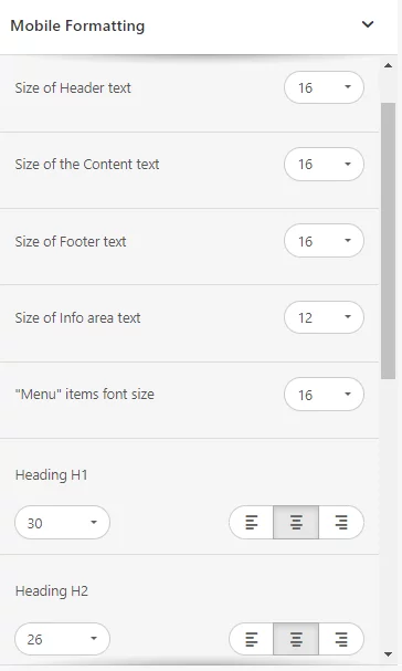
Mobile formatting
Adjusting email content to mobile devices is essential. To keep your messages available and legible for the users across any device, use the Mobile formatting section.
Here, you may:
-
Define text size for all stripe types and headings,
-
Adjust button width and its text size,
-
Adjust content margins.
You can also manage responsive design for images while formatting the image content block:
-
Click the mobile device icon to adjust the image display in mobile devices,
- Use the option Hide on mobile to forbid chosen elements to be displayed in the mobile version of the email.
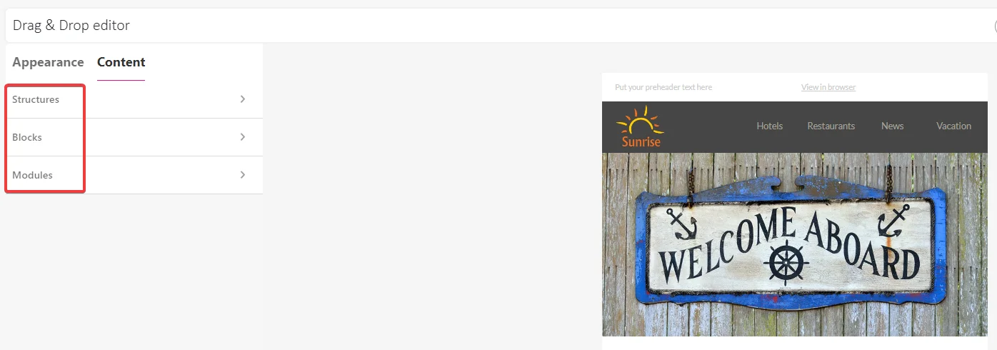
Content menu
In the Content menu, you will find all the elements for building an email:
-
Structures,
-
Blocks,
-
Modules.
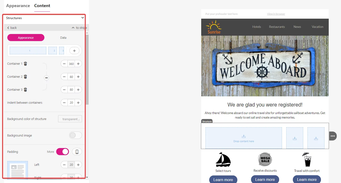
Structures
Structures serve as frames for organizing your email content. Each structure holds a container, which is where you place a content block. Similar to stripes, structures can be saved as Modules for reuse in other email messages.
A structure is second in the hierarchy of elements that contribute an email template. The third element is a container.
To add structure, drag and drop it from the Content menu onto the working area. Place the structure within a stripe. One stripe can contain multiple structures. Each structure has a capacity to accommodate up to 8 content containers in a row. 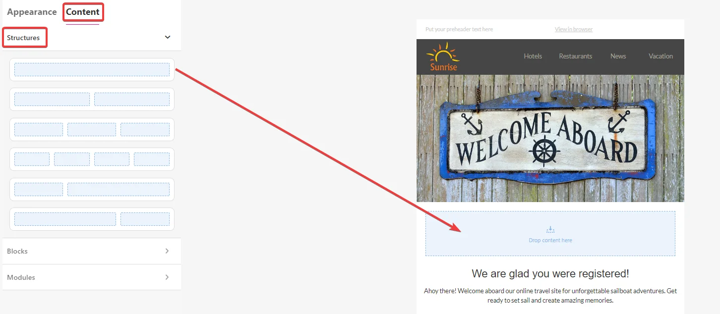
Click on the added structure to access the edit menu on the left side. Customize the structure with options available in the Appearance tab:
-
Add more containers to the structure.
-
Set the container size.
-
Adjust indent (the padding) between containers.
-
Set the background color and the background image of the structure.
-
Configure the full content border.
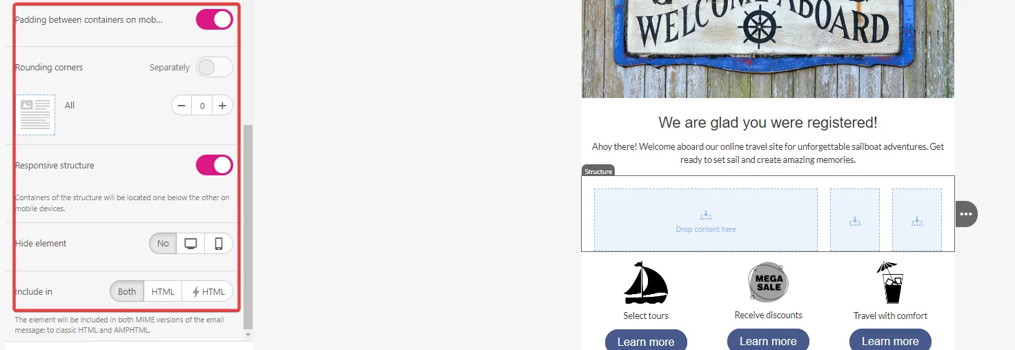
You can also adjust structure layout and appearance on mobile devices:
- Set padding for a structure for desktop and mobile view.
- Configure the structure’s responsiveness.
-
Hide the structure for desktop or mobile view.
-
Specify the structure type – HTML, AMPHTML, or both.
Blocks
Block are the content pieces that you fill the structure with. Blocks are at the bottom of the hierarchy of email template elements.
To add a block to the email template, drag and drop it from the Content menu to the container within a chosen structure. Alternatively, you can use shortcuts for adding image, text and button block by clicking on respective icons in the container.
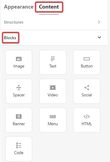
There are ten content blocks available in the editor:
1.Image – upload an image from your computer or add a URL address. You can add alternate text, link the image to an external site, adjust its size and alignment, and manage responsive image settings. 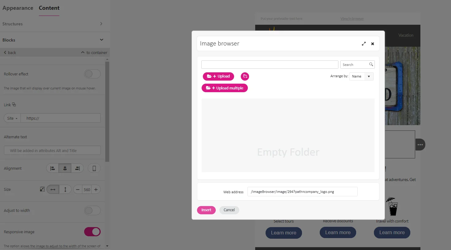
2.Text – this block uses two kinds of menu for styling text content:
3.Button – with the button block you can add external link corresponding to the button’s call-to-action, which you define in the button label field. Style it by setting its color, text color, radius, borders, and padding. 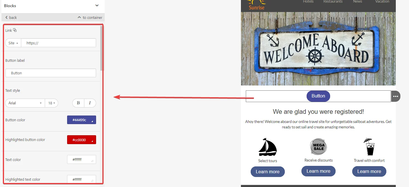
4.Spacer – it helps keep the email content organized. You can choose the line type, adjust its width, padding and alignment. The responsive spacer option allows you to adapt the spacer for mobile view. 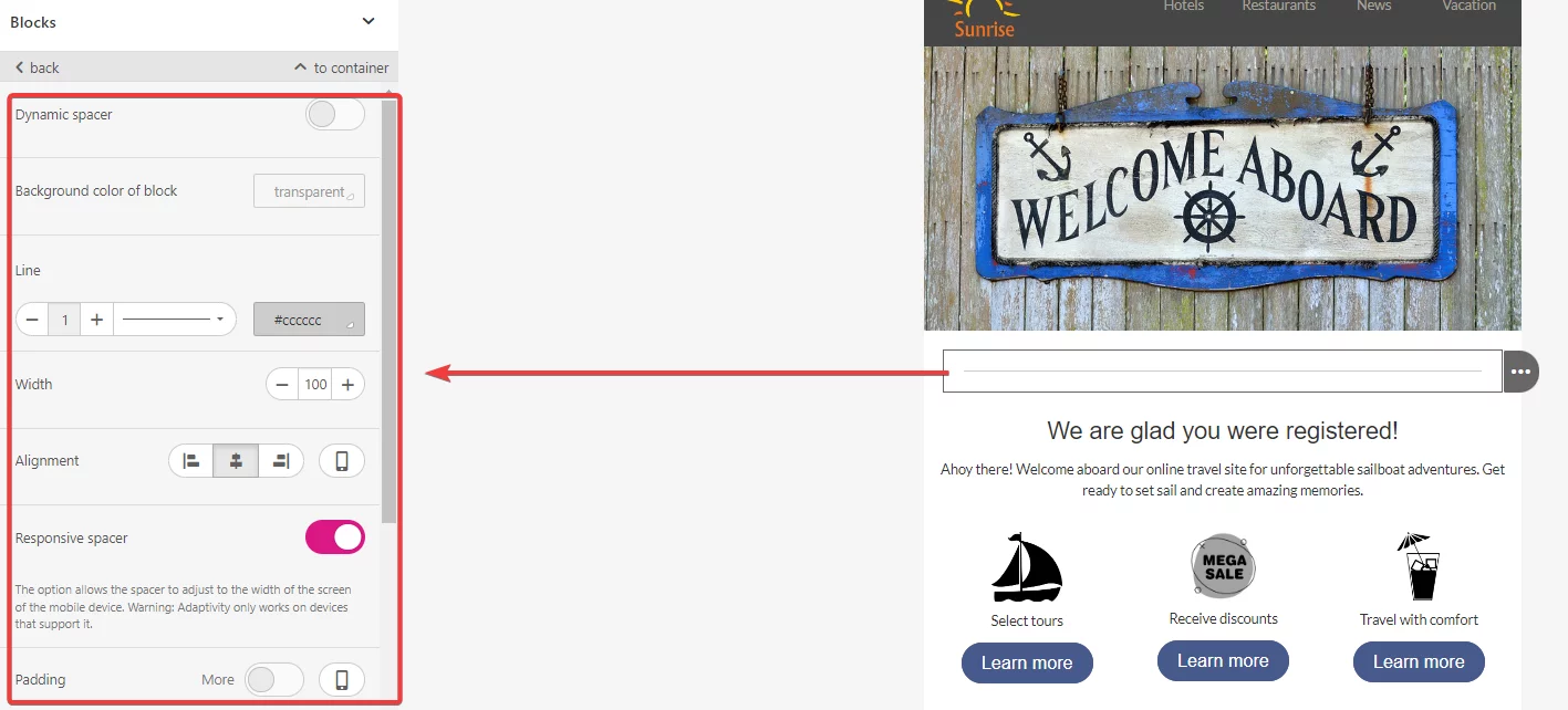
5.Video – with video block you cany embed a video by pasting an external link. Additionally, you can add alternate text, specify a custom thumbnail image, choose a play button style, and adjust video’s size and alignment. 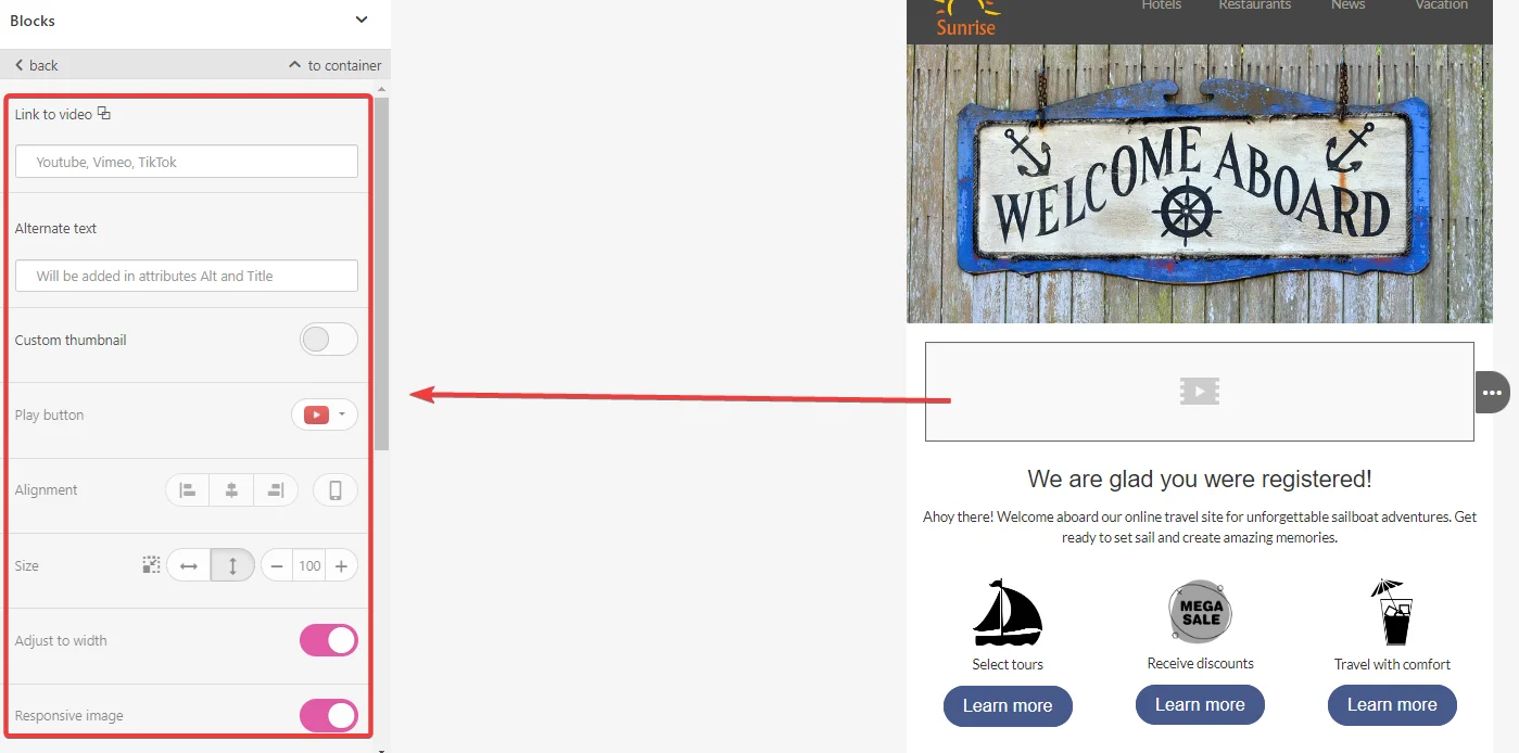
6.Social – a handy block with a set of predefined social media icons. You can choose between multiple icon styles, layout options, and order. It also allows you to add direct links to your social profiles and pages. 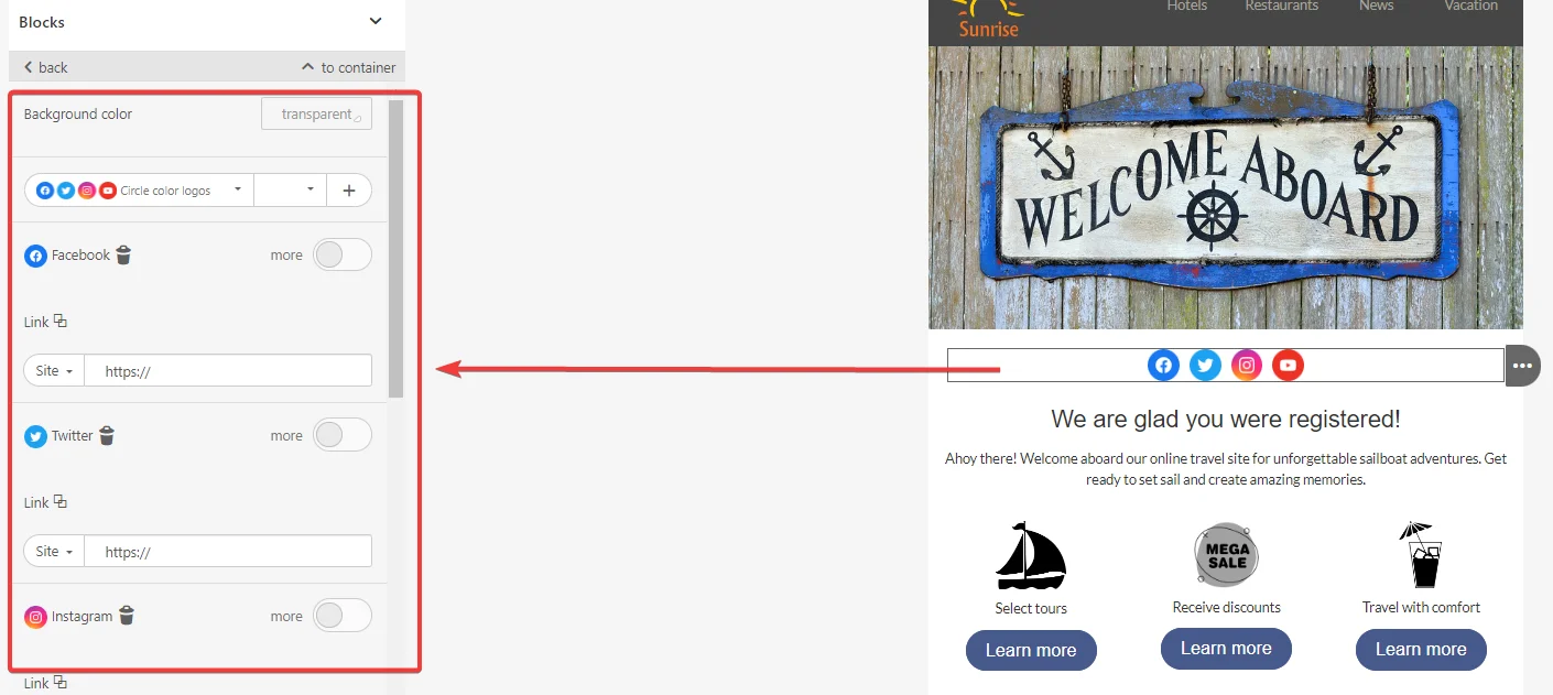
7.Banner – it is a form of image with unique settings such as banner orientation, a set of filers and a fixed height. You can add a link to make the banner act as a call-to-action, directing users to an external landing page. 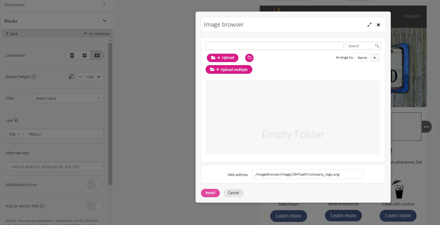
8.Menu – a useful addition to the header section. You can add menu categories that you want to promote and link them to external landing pages. Each category can be styled by adding an icon, changing the text font, size, and color. You can add multiple menu items. 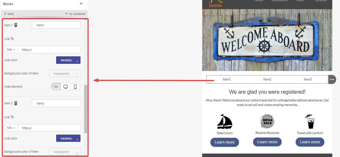
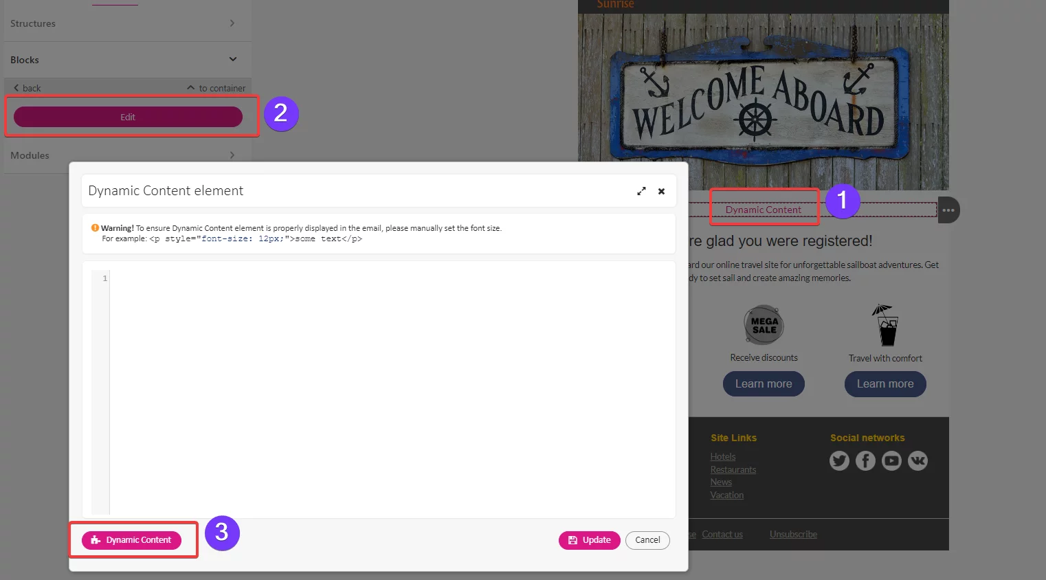
9.HTML – enables adding custom code to the email template. You can add the block to the working space and click to open a code editor window for making modifications.
10.
Modules
Modules are containers, structures or stripes that you design and save for a future use. Modules help reduce time required to create an email.
To save an email element as a module:
-
Hover over the desired element and press the Save as module button.
-
Name the module in the settings panel.
-
Add an optional description.
-
Select a category for easy search.
-
Enter tags that allow grouping modules by similar features, use, or style.
-
Save the changes.

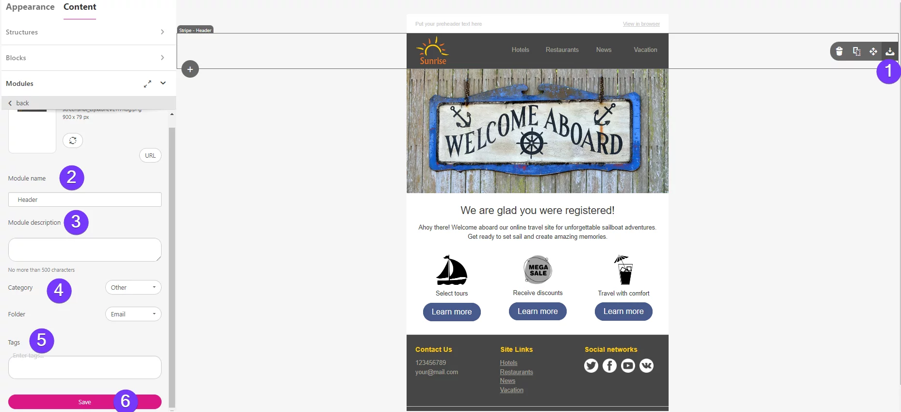
To use the saved module in an email, drag and drop it on the working space.
Working space
The working space is where you build and edit your email template. It serves as a visual representation of how your email will appear to recipients. You can drag and drop elements from the Setting panel onto the working space to add them to your email.
As you add elements to the working space, you can arrange and customize them to create the desired layout. You can move elements around, resize them, and adjust their properties using the edit menus and settings available. The working space provides a real-time preview of your email, allowing you to see how it will look before sending it out.
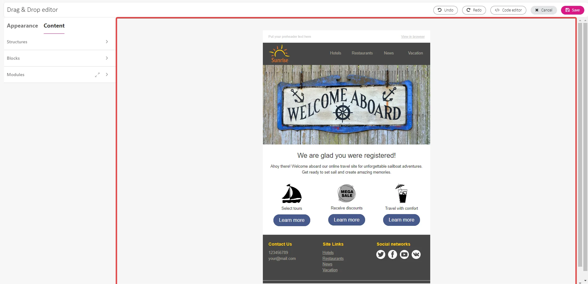
Top toolbar
The top toolbar provides you with additional functionalities and tools to enhance your email creation process:
-
Undo and redo any email editing action. This allows you to revert changes or restore previous versions of your design.
-
Access code editor to make advanced modifications to the HTML or CSS code of your email template. This option is useful for users with coding expertise who want to customize their email design further.
-
Cancel your work and close the editor without saving any changes.
-
Save your email template.
