Pop-ups
A pop-up is a window with graphics that appears to customers visiting your website. Using pop-ups, you can inform customers about ongoing promotions, new products, or encourage them to subscribe to your newsletter. Based on data collected in the platform, you can personalize pop-up content and display it to previously defined customer segments.
Requirements
Pop-ups work based on data collected from your store’s website. To ensure they display correctly, make sure that Web Tracking channel is properly configured.
Pop-ups – statuses and marketing metrics
You can find the statuses of all created pop-ups and their effectiveness data in the table under Automation > Pop-ups. This allows you to track the results of each pop-up and adjust your sales strategy.
Pop-ups have the following statuses:
- All – this category displays all pop-ups saved in the platform
- Active – shows pop-ups currently running on your website. From this level, you can’t edit the pop-up, but you can preview its design, deactivate, or delete it.
- Inactive – shows pop-ups that aren’t in use. This list doesn’t include drafts. From this level, you can activate any pop-up by clicking the Activate icon.
- Draft – shows pop-ups that are being designed. You can finish the pop-up design by clicking the Edit icon.
- Deleted – shows a collection of all deleted pop-ups. There’s no possibility to restore a pop-up once it’s deleted.
Marketing metrics available in the table:
- Views – shows the total number of pop-up displays during your set timeframe, across all pages of your store.
- Clicked – shows the total number of clicks on the displayed pop-up.
Creating pop-ups
Click the Create new pop-up button on the right side above the table.
At the top, you’ll find a progress bar with pop-up creation stages. The current stage is underlined with a colored line. You can freely move between stages by clicking on them.
After moving to Summary, previous stages might show a dot — this indicates that the stage needs completion.
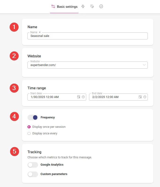
Step 1: Basic settings
In this section, you’ll enter initial information about how the pop-up should work.
- Give a name to your pop-up, it will be visible in the control panel.
- In the Website section, select the website address where the pop-up should appear from the dropdown menu.
- Choose the Time range for the pop-up – set start and end dates for pop-up display.
- In the Frequency section, you’ll set how often the graphic appears:
- Display once per session — shows the pop-up once during a customer’s visit to your store. If the customer leaves your store by closing the browser tab or window, this ends the session. If they visit again, the pop-up will be displayed.
- Display once per + filter — set how many times per time unit the pop-up should be displayed, e.g., once every 2 days, once every 2 weeks.
- In the Tracking section, you will enable tracking of custom and Google parameters.
Step 2: Behavior
Here you’ll decide in what situation the pop-up will appear. In the Event field, choose one or more of five actions:
- Visit –pop-up will appear when the user enters the page.
- Exit intent – pop-up will appear when the user moves the cursor outside the store window.
- Scroll – pop-up will appear when the user starts scrolling the page. Set a threshold (page scroll depth in %) that will trigger the pop-up.
- Add to cart – pop-up will appear when the user adds an item to cart.
- Remove from cart — pop-up will appear after removing any product from the cart.
- Custom event – your pop-up will appear when a user takes a specific action in your store, like clicking a button or link, instead of showing up right when they land on the page. To use custom events, you’ll need to complete a few extra steps. You’ll find the instructions in the How to set up a custom event section.

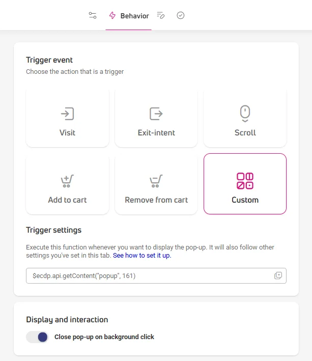
In the Display and interaction section, you can enable closing the pop-up by clicking on the background.
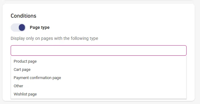
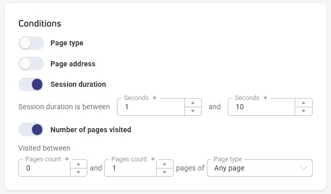
In the Conditions field, you’ll set additional requirements that specify when pop-ups appear:
- Page type – click the displayed window and choose the type of subpage where your pop-up should appear, e.g., a product page, a cart page, a payment confirmation page or other pages.

- Page address – three filters will appear to help you set the target page or pages for the pop-up:
- Condition – choose option: equals, starts with, contains, or regular expression. [Regular expression option opens a window for entering up to 10 regular expressions.]
- Value – enter an expression, number, or keyword contained in the page address
- Test value – enter the address of the page or subpage where you want to test the pop-up. After entering, click Test and check if the pop-up appeared on the page.

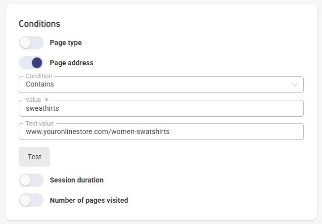
- Session duration – set the time interval after which the pop-up will appear when a user enters the page, e.g., between 3 and 5 seconds.
- Number of visited pages – set the number of pages after which the pop-up should appear. Also indicate the type of pages the user must have visited for the pop-up to be displayed: any page, product page, cart page, payment confirmation page.
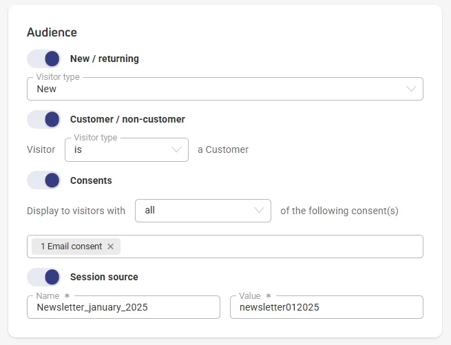
In the Recipients field, you’ll narrow down the number of recipients who will see the pop-up.
- New / returning – choose user type from the dropdown list.
- Customer / non-customer – choose whether the pop-up should be shown to current customers of your store or only to people who aren’t yet your customers.
- Consents – decide how many and what consents recipients must give to see the pop-up. You can choose one or many consents:
- Show to visitors who gave all consents – pop-up will be seen by visitors who gave all consents you selected.
- Show to visitors who didn’t give consents – pop-up will be seen by visitors who didn’t give any of the consents you selected.
- Show to visitors who gave any consents – pop-up will be seen by visitors who gave one of the consents you selected.
- Session source – indicate where customers who will see the pop-up should come from, e.g., specific social media channel, search engine, article linking to the pop-up page. You can also provide a UTM tag for a specific marketing campaign.
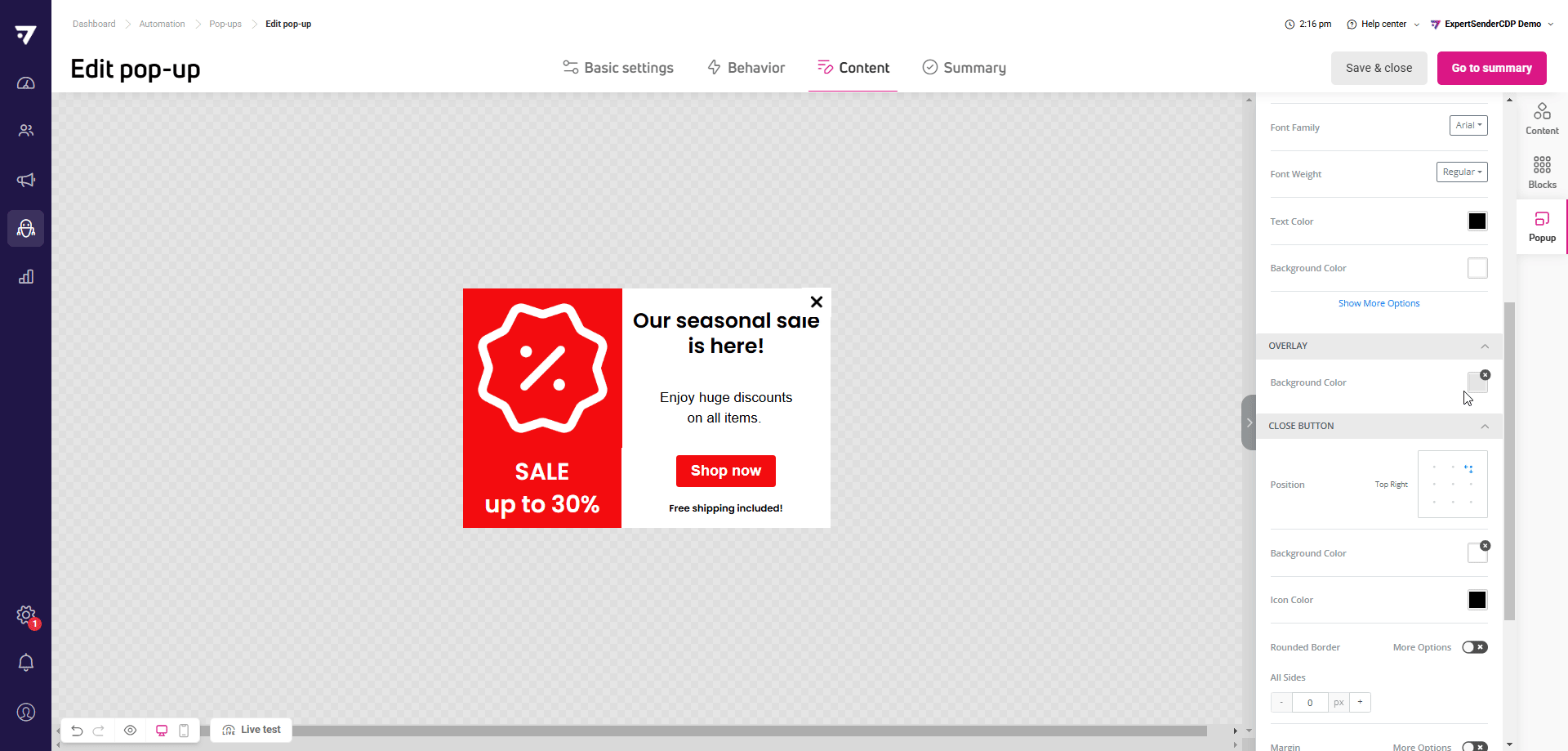
Step 3: Content
The editor is used for designing pop-ups. You use the same editor in ECDP for creating emails, forms, and banners.
If this is your first encounter with the platform’s editor in ExpertSender, you’ll find a detailed description of its functions and content blocks in the article: How does the content editor work?
In the editor, you can also create a pop-up with cart contents or recommendations. You’ll find a detailed description in this article: Cart and recommendations in content – step-by-step configuration (link)
“Pop-up” tab
In this tab, you’ll set where the pop-up will appear on computer, phone, or tablet screens and test how the pop-up looks on your page.
In the Pop-up section, you’ll set:
- Position of the pop-up on the page.
- Its Width in pixels, percentages, or automatic.
- Decide if the pop-up should have rounded corners.
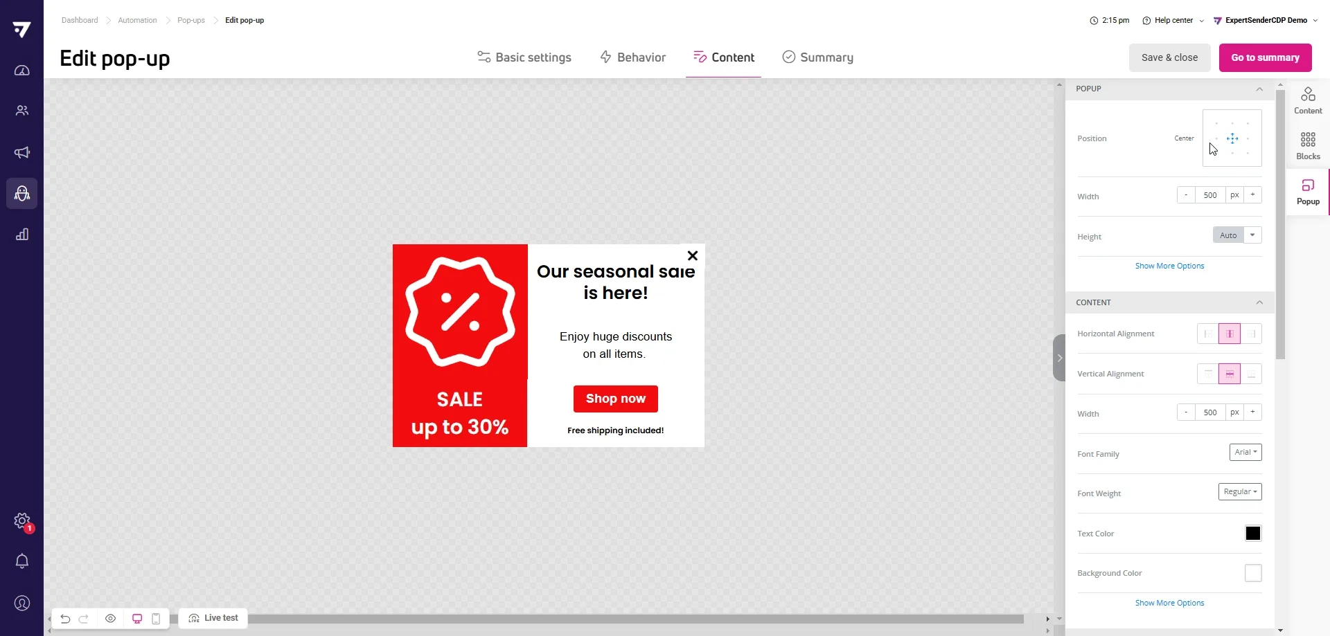
In the next sections, you’ll set:
- Content – appearance and position of content displayed in the pop-up.
- Overlay – background color visible behind the pop-up.
- Close button – placement and appearance of the close button visible on the pop-up.
- Links – color, underlining, and change in link appearance on hover.
Step 5: Summary#
This is the final stage of creating pop-ups. Here, you’ll check how your pop-up displays on computer and mobile device screens. Click the Desktop and Mobile icons to switch between views.
On the left side, you’ll find a checklist with elements necessary for publishing the pop-up on your page:
- Elements entered correctly are highlighted in green.
- Elements requiring improvement are in red. You can fix them by clicking the pencil icon.
- Orange marking is added to elements that could work better, but improvements aren’t necessary for displaying the pop-up.
- Blue is usually additional, marketing information that can add value to your content.
At this stage, you can save the created pop-up for later or launch it:
- Save and close – this button will save the message as a draft and take you to the pop-up list in the control panel.
- Activate – clicking this button will publish the pop-up on your page.
How to set up a custom event
A custom event takes the form of a function: $ecdp.api.getContent(type, id, maxWaitTime).
This function contains three parameters related to the content you want to display:
- type – required – specifies the content type, e.g. popup.
- id – required – specifies the identifier of the specific content you want to display. You’ll find the ID in Automation > Pop-ups > ‘ID’ column.
- maxWaitTime – optional parameter (in milliseconds) – determines for how long the system will try to display the pop-up after a user action. The time range is 0-10,000 milliseconds (defaults to 0 ms). You don’t need to include the maxWaitTime parameter.
For the custom event to work correctly and the pop-up to display on the desired action, please wait for our tracking script to load.
You can check this using the function: $ecdp.helpers.websiteIsReady
Add a custom event to your page’s HTML code
You can attach the function to a specific element on your page, like a button or link. This way, your pop-up will appear automatically when someone clicks that element. Here are two examples. Both use the getContent method, which triggers the pop-up with the specified ID.
Example 1: Button
<button id="myButton">Display pop-up</button>

<script>
document.getElementById("myButton").addEventListener("click", function() {
    $ecdp.api.getContent("popup", 586);
});
</script>
Example 2: Link
<a href="#" id="popupLink">Display a pop-up</a>

<script>
document.getElementById("popupLink").addEventListener("click", function(event) {
event.preventDefault(); // Prevents the link from navigating
    $ecdp.api.getContent("popup", 586);
});
</script>
In both cases, the function:
- “listens” for clicks.
- triggers the pop-up with ID 586 when clicked.
Make sure the selected pop-up has Active status, otherwise it won’t display.
Example 3: Checking if the script has been loaded before triggering the pop-up
// Check if ECDP script is ready and trigger pop-up
if ($ecdp.helpers.websiteIsReady) {
    // Website is ready, trigger the pop-up
    $ecdp.api.getContent("popup", 586);
} else {
    // ECDP script not ready yet, wait and check periodically
    const checkReady = setInterval(() => {
        if ($ecdp.helpers.websiteIsReady) {
            $ecdp.api.getContent("popup", 586);
            clearInterval(checkReady);
        }
    }, 100);
}
Add a custom event in the drag & drop editor
If you prefer not to edit your page code directly, you can use the HTML content block in the drag & drop editor. This method requires JavaScript code.
In the drag & drop editor:
- Find and add the HTML content block.
- Insert the JavaScript code from the examples above.
- Adjust the element IDs and pop-up parameters to fit your needs.
Important notes
- The pop-up will only load after the function is called.
- It will display only once per page view, for the same combination of type and ID parameters.
- Custom events only work for pop-ups with Active status.
Add a custom event using Google Tag Manager
If you don’t want to manually edit your page code, you can use Google Tag Manager to add a custom event. This solution works well if you’re already using GTM and want to use custom events without developer help.
To use this method, you need a Google Tag Manager account connected to your store.
Create a tag with a custom event that triggers the pop-up
- Go to Google Tag Manager.
- Navigate to the container connected to the page where you’ll place the code.
- Go to the Tags tab.
- Click New to create a new tag.
- Name your tag, for example ‘Custom event – link click’ then click Tag Configuration.
- Select Custom HTML.
- In the HTML section, insert the function with defined type and id parameters, for example: $ecdp.api.getContent(“popup”, 586); These parameters specify which content created in ECDP will be triggered by the link click.
Set when the tag should fire
- Go to the Triggers section, where you configure the rule that will trigger the tag.
- Select Click – All Elements from the list.
- In the This trigger fires on section, select Some Clicks.
- In the Fire this trigger when an Event occurs and all these conditions are true section:
- in the first field, select Click Text.
- in the second field, set the condition to equals.
- In the last field, enter the text that should trigger the pop-up when clicked.
- Save your changes.
If you don’t see Click Text variable in the dropdown menu, make sure it’s active:
- Go to the Variables tab.
- Click Configure.
- In the Clicks section, check Click Text.
Test if the tag works
- Test if the code was added correctly – click Preview in the upper right corner of the screen.
- Then go to your page and click the text that triggers the pop-up function.
- Return to the preview window and check if the created tag was triggered.
Close the preview window and click Publish.
How to live test an opt-in prompt triggered by a custom event
The function must be called in the browser when you want to test the prompt with a custom event using the “Live test” option:
- Go to your store page and open the Inspect tool:
- using your keyboard by pressing F12,
- or right-clicking and selecting it from the context menu.
- Select the Console tab.
- Type or paste the copied function with the prompt parameters.
- Press Enter to run the script.
This will trigger the prompt directly from the console, which is necessary to activate the custom event.