How does the content editor work?
The editor allows you to design the content and appearance of emails, pop-ups, banners, and forms. You’ll also use the editor when creating email content in scenarios and confirmation messages.
The editor lets you create all types of content from scratch. You can also add your own design using the HTML content block.
The editor interface consists of three parts:
- workspace
- top toolbar
- content settings and appearance panel
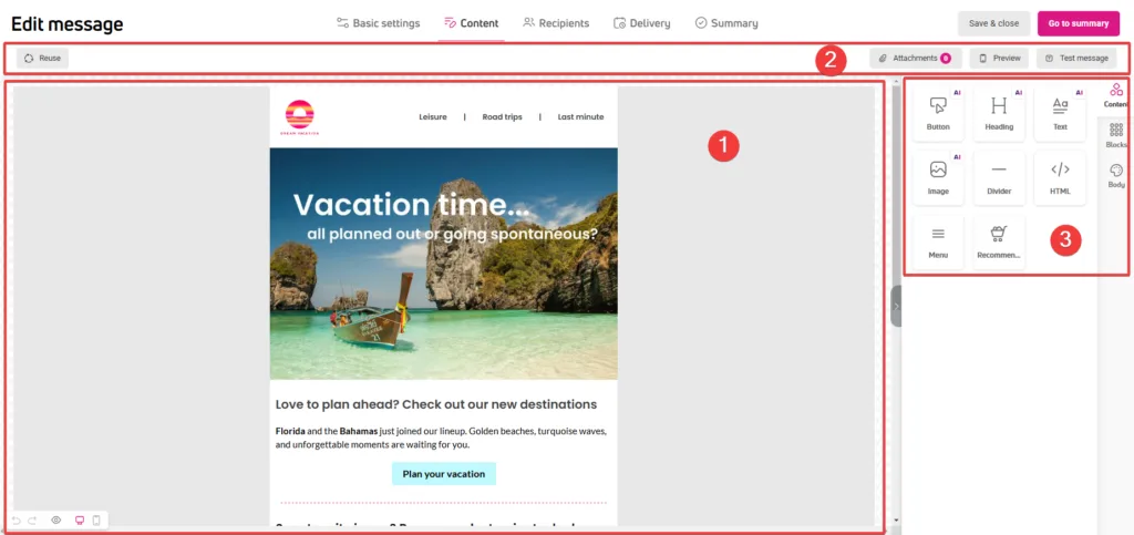
The workspace
The workspace takes up most of the screen. Here, you create emails, banners, forms, and pop-ups in real-time by adding content blocks and grouping them into rows using drag and drop. You can edit elements in the workspace or in the panel on the right.
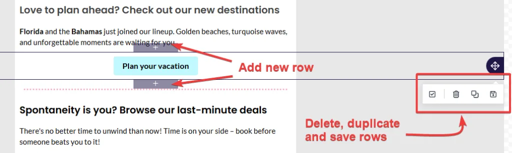
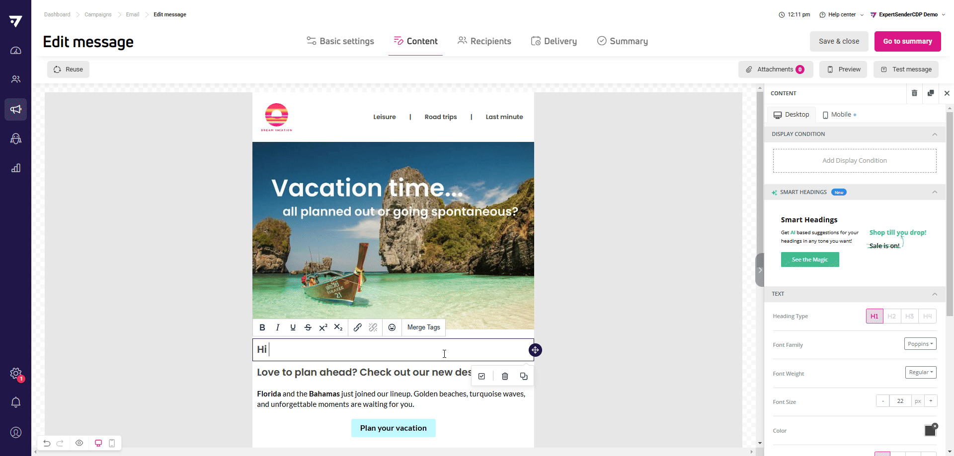
To delete a content block, click it to bring up a contextual menu with these functions.
You can delete and duplicate rows the same way. In the same menu, you also have the option to save the row. The saved row will appear in the Blocks tab, available in the right panel.
Restoring content version and selecting an editing view
At the bottom, on the left side of the workspace, you’ll find a bar with functions:
- Undo and redo – you can undo changes back to the first change made in the message being created or edited.
- Preview – opens an advanced preview window where you can check how your design looks on selected devices and resolutions. If you’re using ‘Hide on desktop’ or ‘Hide on mobile’ options while designing content, the preview will show you how the newsletter will ultimately look in that view. In the preview, you can also check how your content presents in dark mode.

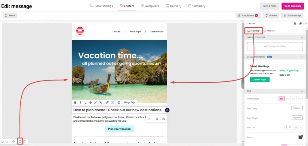
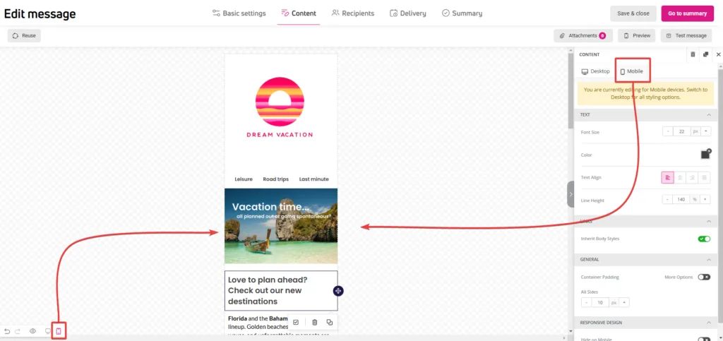
- Desktop and Mobile views – allow you to switch the workspace view between display modes in real-time.
Top toolbar
The top toolbar is only available for e-mail messages.
When creating an email message, additional functions will appear above the workspace and editing panel:
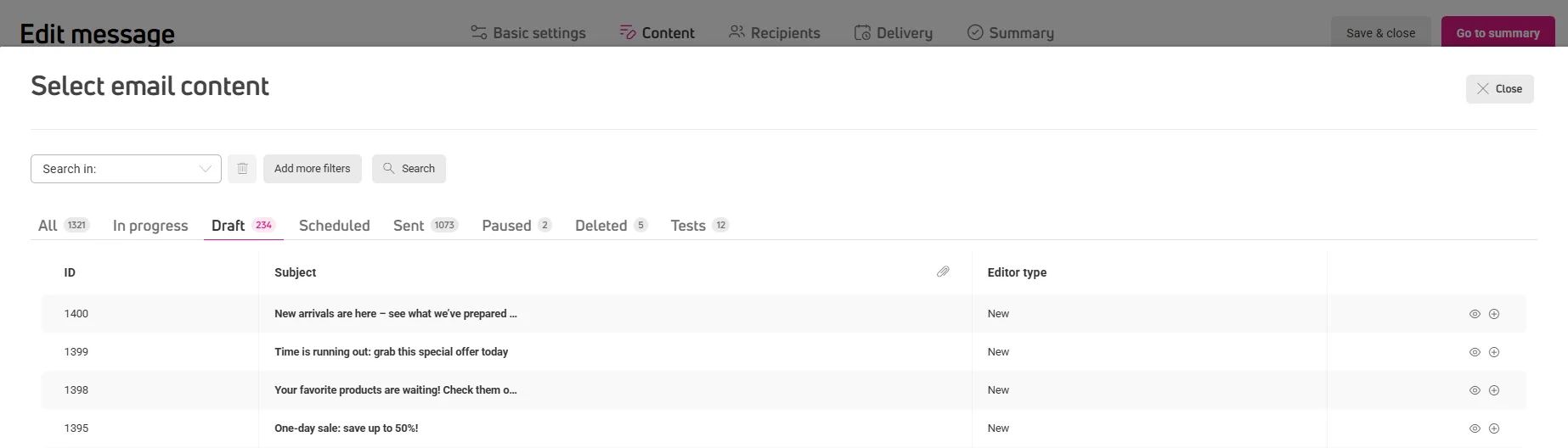
- Reuse – this button opens a window with a table of previously created emails. Click Select to add the email to the workspace.

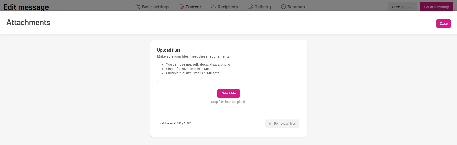
- Attachments – allows you to attach one or multiple files in jpg, pdf, docx, xlsx, zip, png, doc, or csv format with a total size up to 1 MB.

- Preview – opens a window with message preview in two views, desktop and mobile. If you’re personalizing the message using dynamic content, you can preview how it will look using random or existing customer data.
- Test message – clicking opens a window with email address lists for sending messages. From here, you can also create a new address list for sending test messages.


Appearance and content settings
On the right side of the workspace, you’ll find a content design panel with the following tabs:
- Content blocks.
- Blocks including columns and rows.
- Content style – tab visible when creating email messages, banners, and forms embedded on pages.
- Pop-up settings – tab available only when crating a pop-up and a form displayed in a pop-up.
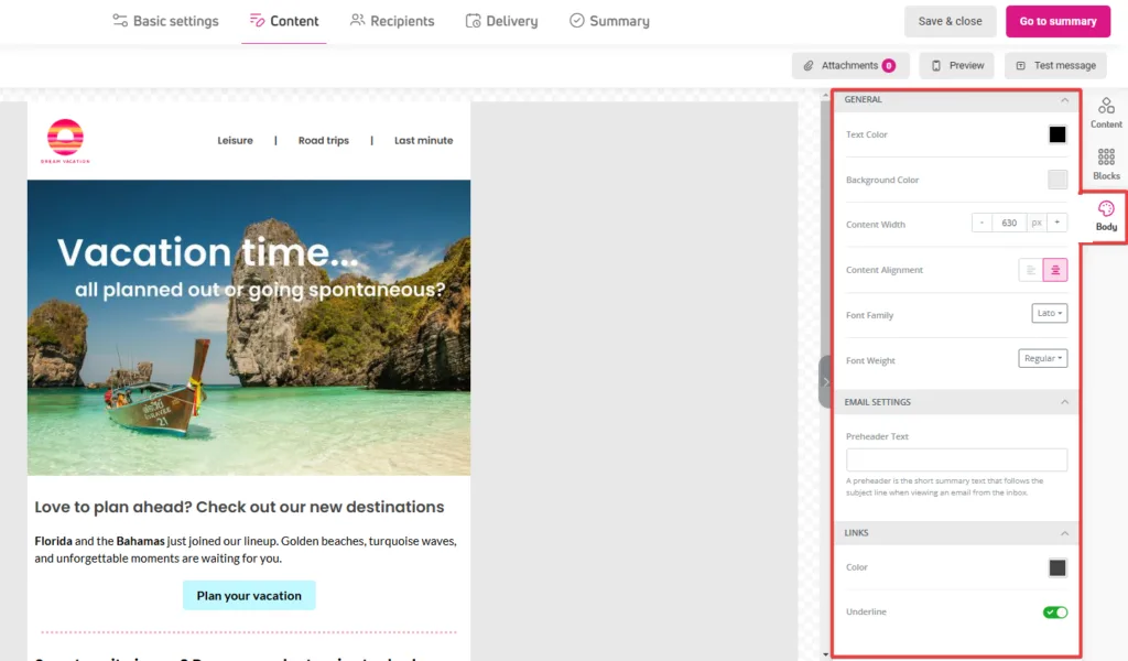
Content and pop-up: set the appearance of the entire project
In the Content tab you’ll manage settings for an email message and a banner:
In the Pop-up tab, will manage the general style for pop-up and pop–up form :
- Workspace background.
- Width of the selected content type in pixels – e.g., 600 px for email messages.
- Font and text alignment.
- Link color and underlining.
- Pop-up-placement on the page.
- Email message preheader.
- Banner or form background image.
These settings will apply to all elements, so it’s best to start designing content from this tab.
If you plan to change the appearance of a selected element, you can do this by editing its individual settings. Click the selected block or content and go to edit its settings in the right panel.
Blocks: group your content
Blocks group elements with identical settings. A block consists of one row of columns. A column can hold any number of content blocks stacked one below another.
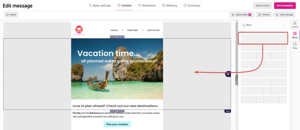
You can add a new block from the Blocks tab in the right panel or directly in the workspace. Hover over the workspace next to an existing element. Click the “+” icon placed at the bottom center of the frame.
You can access other block management functions the same way. From here, you can delete, copy, move, and save the block, as well as add display conditions – individual guidelines for when and to whom the selected block should be displayed.
In the tab, you can choose settings for the entire selected content block and columns within this block.
Column properties
In this section, you can decide on the layout and number of columns in a row. Each column in the row can have individual settings, such as background color, margins, or border type.
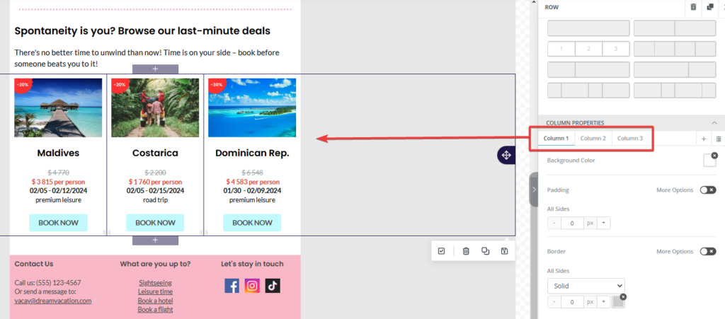
To change the width of individual columns in a row, drag the inner edge of the selected column. For example, you can set one column’s width to 70% and another to 30%. The right panel will show a dynamic preview of all column widths in the row. Each column’s width is shown as a percentage.
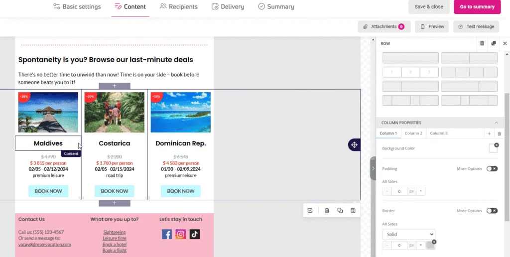
Row properties
Here you’ll set the appearance of the selected row. Just make sure that the row you want to edit is selected in the workspace. These settings will affect the entire selected row settings you can apply include background color and margin size.
Content: add text, graphics, or buttons
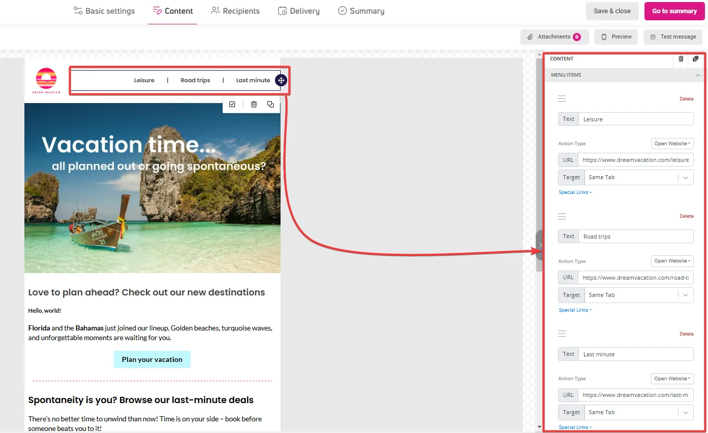
In this tab, you’ll find content necessary for designing emails, pop-ups, and other formats. You have 7 basic content blocks available plus additional blocks available only in selected formats, such as recommendations or forms.
What content can you add to your projects?
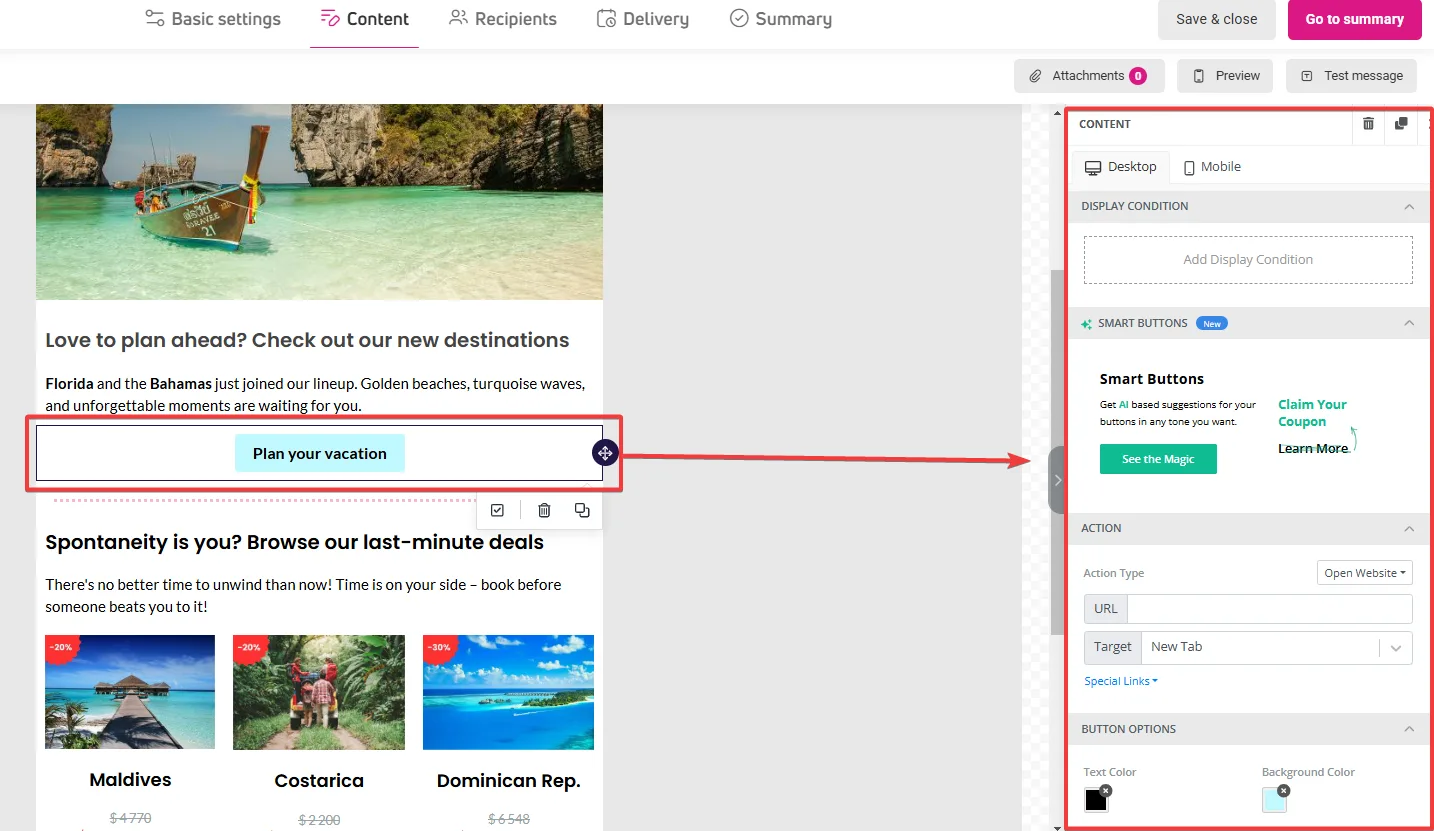
- Button – allows adding a graphic-text block as a button. You can add the button text (call-to-action, CTA) yourself or use AI suggestions available in the button settings panel.

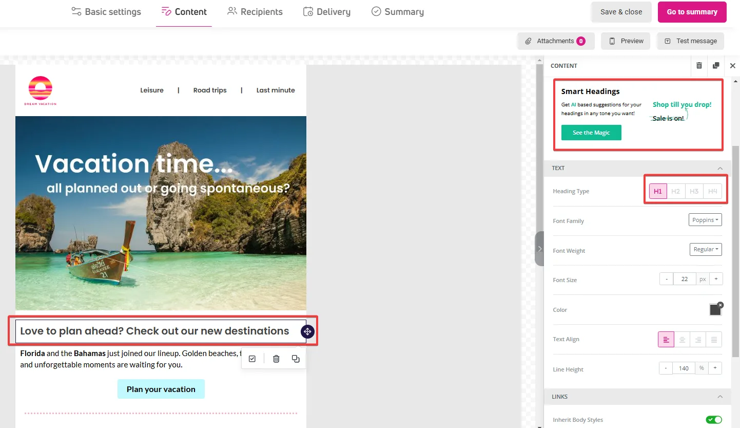
- Heading – useful for giving structure to the content. If you’re stuck, you can use AI help to create a fitting heading.

- Text – allows adding a text field. You can enter text manually by typing directly in the text field or pasting a previously prepared paragraph.
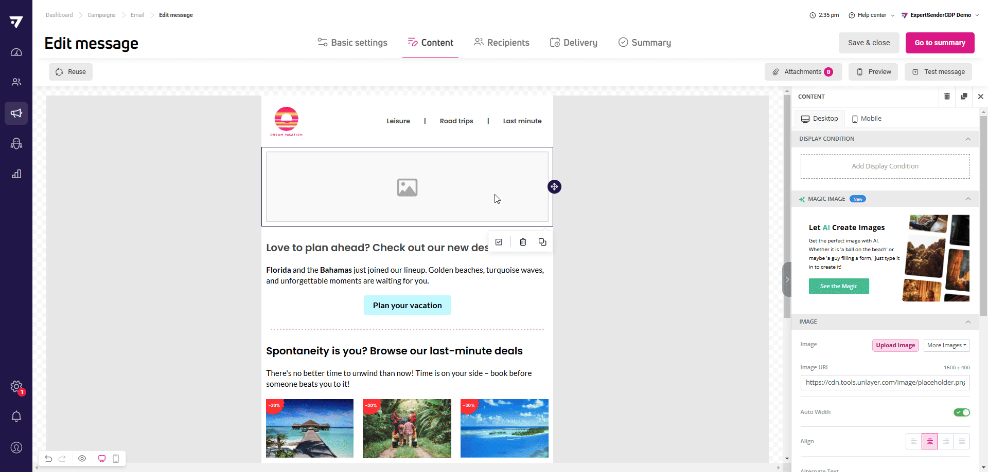
- Image – allows adding images from your disk, media library, or via external link. You can insert images in PNG, JPG, JPEG, and GIF formats, with a maximum size of 2 MB.
- Divider – used to separate other content blocks. Use these instead of ‘enters’ in text blocks for better message appearance.
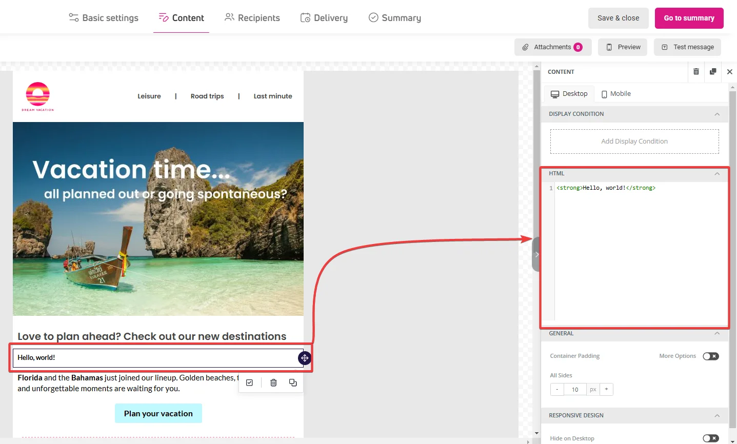
- HTML – block allows adding a fragment or entire message as HTML and CSS code. You can place your own code in the editor window, displayed in the right panel. Make sure the entered code is correct and meets the requirements for message or form layout.

- Menu – displays a horizontal list of links. You can add any number of them. We recommend adding a maximum of 4 items to maintain content readability.

- Timer – available in the Blocks tab – allows adding a counter with date and time . You can adapt the timer to the time zone of your choice.
- Socials – available in the Blocks tab – useu to add links to social media platforms in ypur content.
Content blocks available in selected formats are:
- Recommendations – available in emails – block displaying product recommendations based on chosen personalization filters, such as bestsellers or complementary items.
- Products – available in banners and pop-ups – block displaying cart contents or product recommendations in selected mode (personalized recommendations, complementary, popular, or bestsellers).
- Form – available only in forms – allows designing a form that will appear on your page in a selected location or in a pop-up.
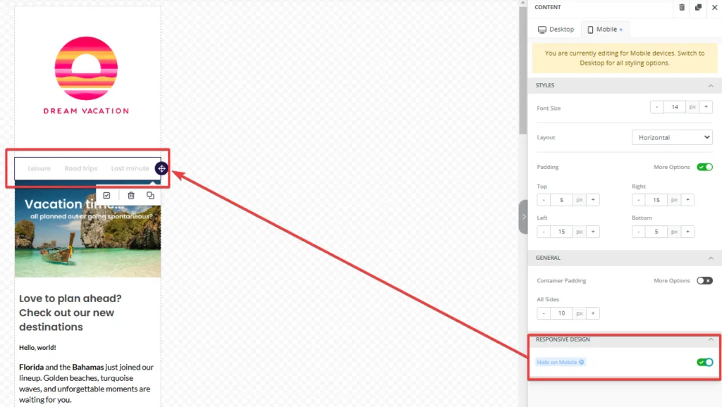
Designing responsive content: desktop and mobile device views
The editor enables designing any content in two views: desktop and mobile devices.
The desktop view allows for presenting more complex layouts and content, while on mobile devices, the key is to simplify navigation and readability.
You can switch between views from two places:
From the menu on the right, visible when a row or content block is selected.
From the bar at the bottom of the workspace.

Some content block and row settings differ in the mobile view, making it easier to adapt content for smaller screens. Therefore, we suggest starting design from the desktop view to create the general structure, then adjusting the layout and display parameters for mobile devices.
In both views, in the Responsive design section, you can decide which elements should be visible and which hidden, giving full control over adapting content to user needs.
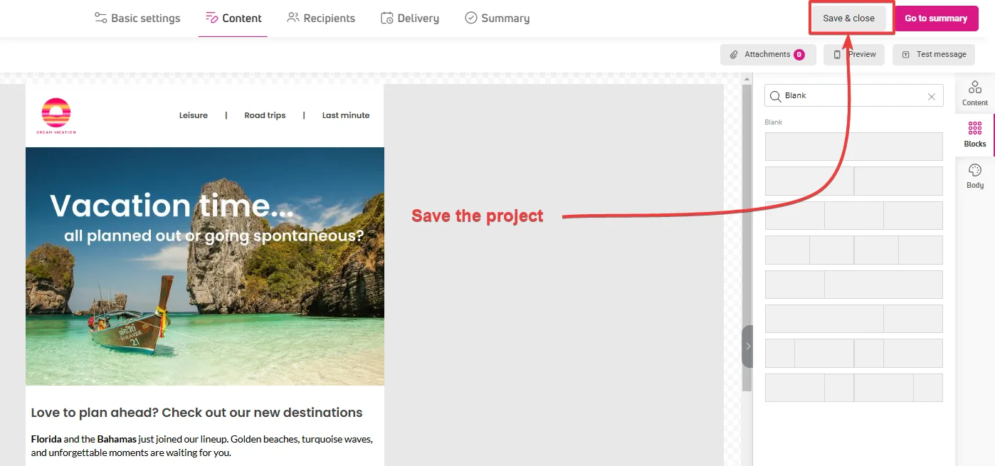
How to save created content for reuse?
Remember to regularly save your projects, as the autosave feature is not yet available.
You can save your designed content in two ways:
- Entire project – using the Save and close function. This will save all created content, along with settings in other tabs (recipients, basic settings, delivery).

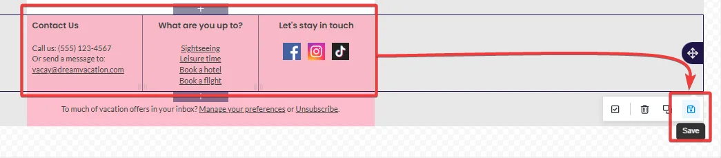
- Single block – click on the workspace next to the element – a row frame with actions will appear at the bottom. Click Save. Enter a name for the saved row; you can also add tags to help find saved content. You can edit an already saved row. If you want to keep the changes, a new version of the row will be created. You’ll find saved rows in the Blocks tab in the left panel.

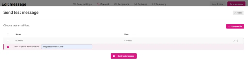
Sending test emails
This option is only available for email messages.
Other types of content can be checked using the Preview function, which you’ll find in the bottom left corner of the workspace.
Use this option to test how content behaves in different email clients.
- Click Test message in the top toolbar.
- Enter the address or addresses where you want to send the message:
- For one-time sending – enter addresses manually
- If you regularly test your messages, create a test list
- Click Send test message.
You’ll find sent tests in the table, in both All and Tests tabs.